Spectrum
A vibrant journey of self-discovery with color at center-stage.
Color isn't just an eye-catching element in visual media; it's a powerful language that strengthens and deepens any message. Yet, this language remains somewhat enigmatic, its full potential waiting to be unlocked. This project delves into the fascinating world of color communication, exploring how colors speak for themselves and their ability to tell stories and evoke emotions. By examining how others have used color, I began this kaleidoscopic journey.
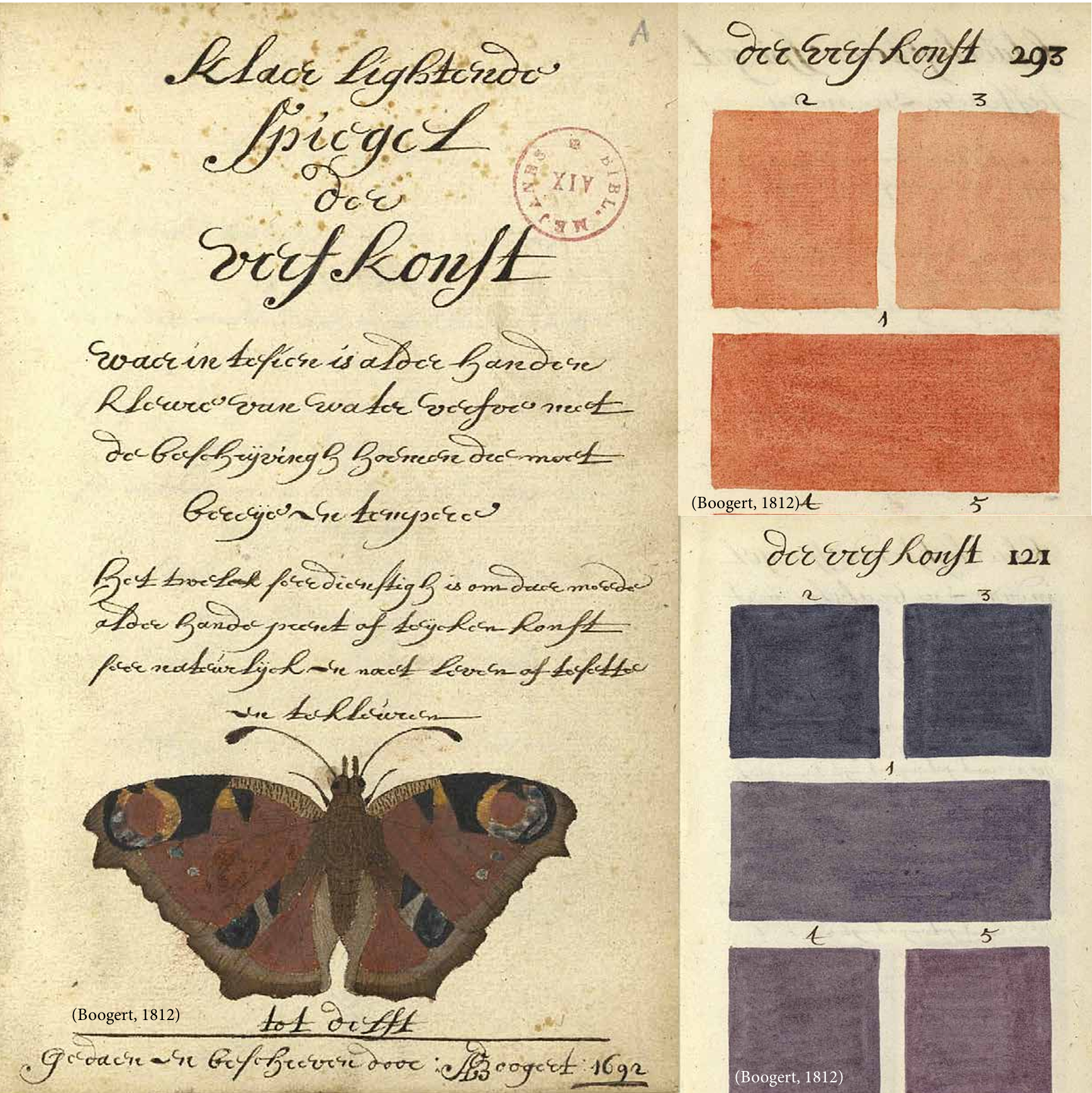
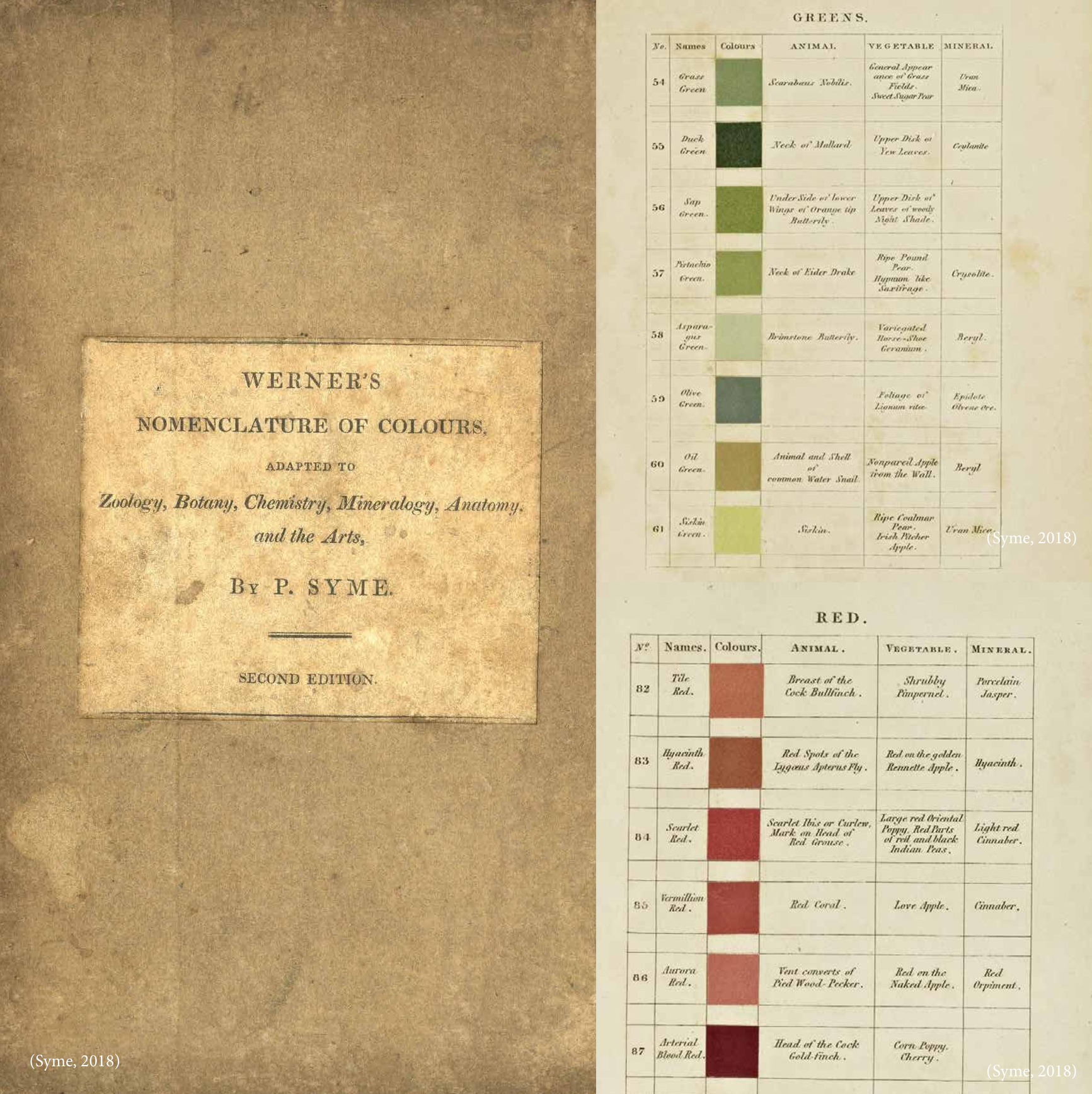
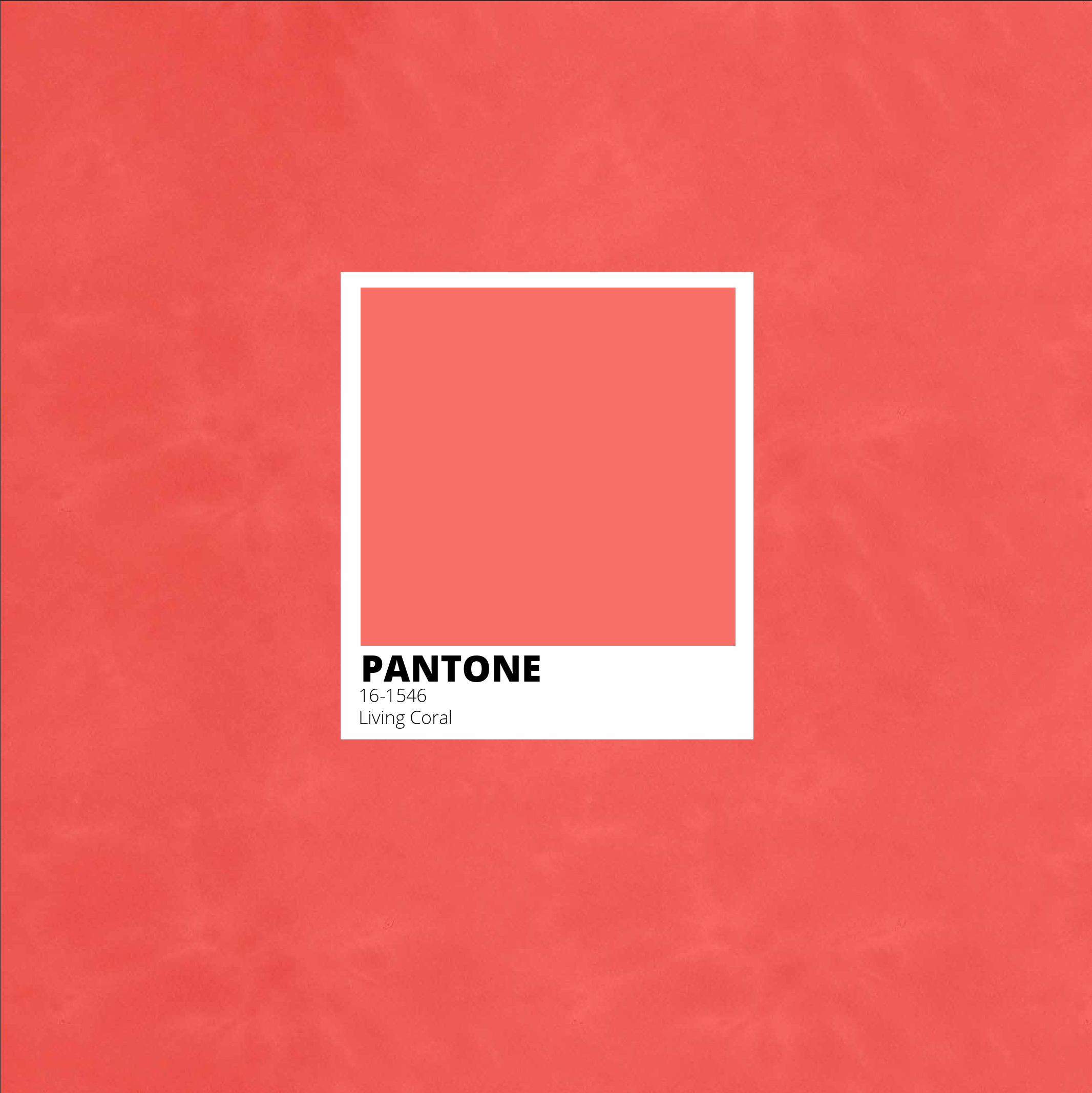
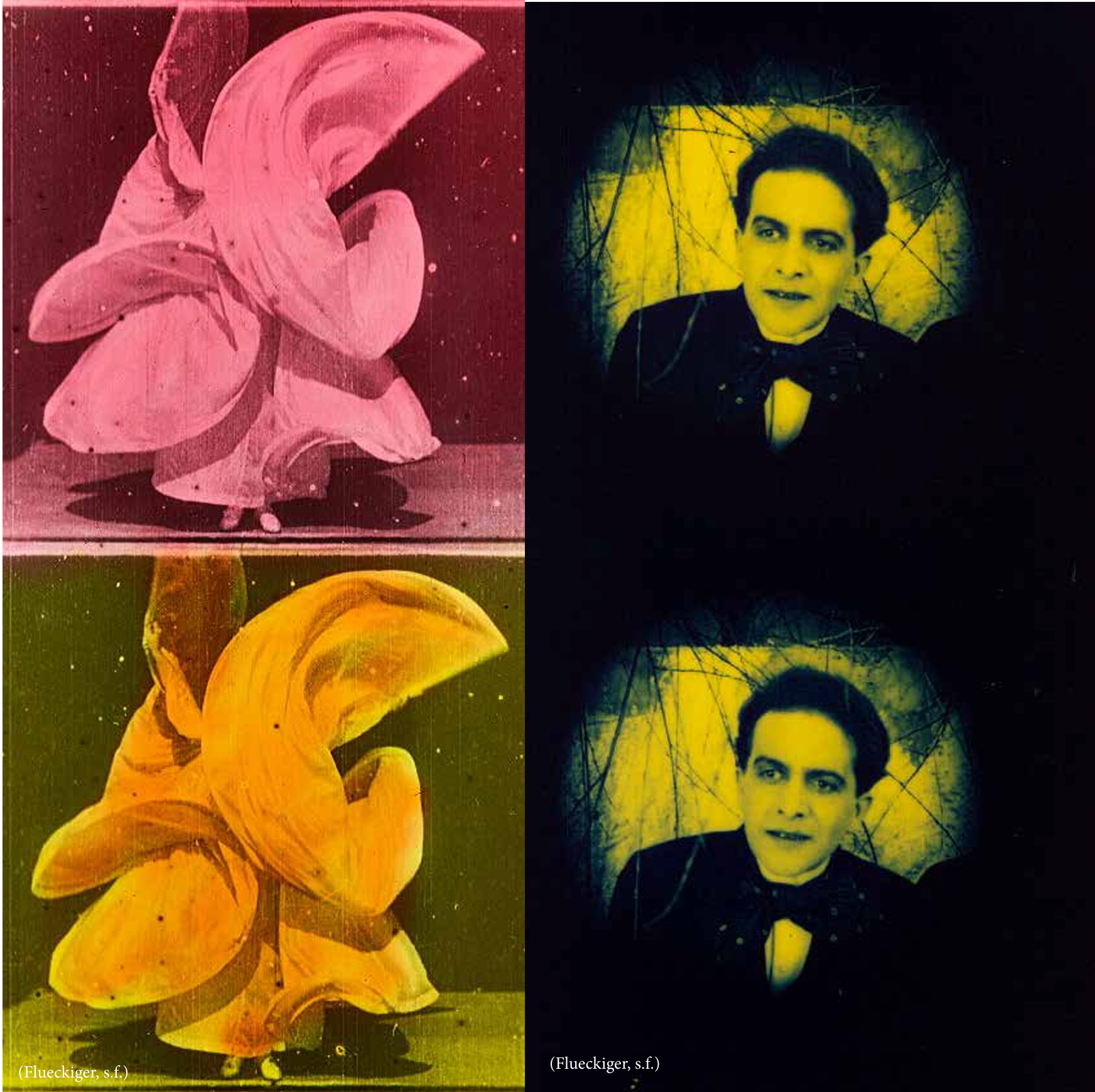
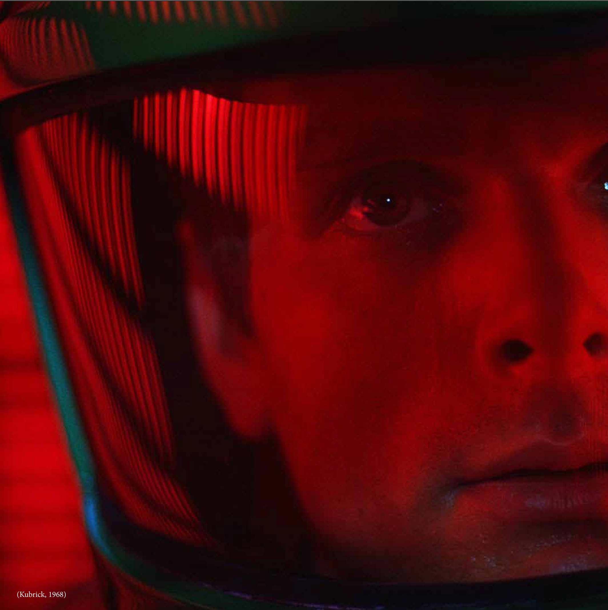
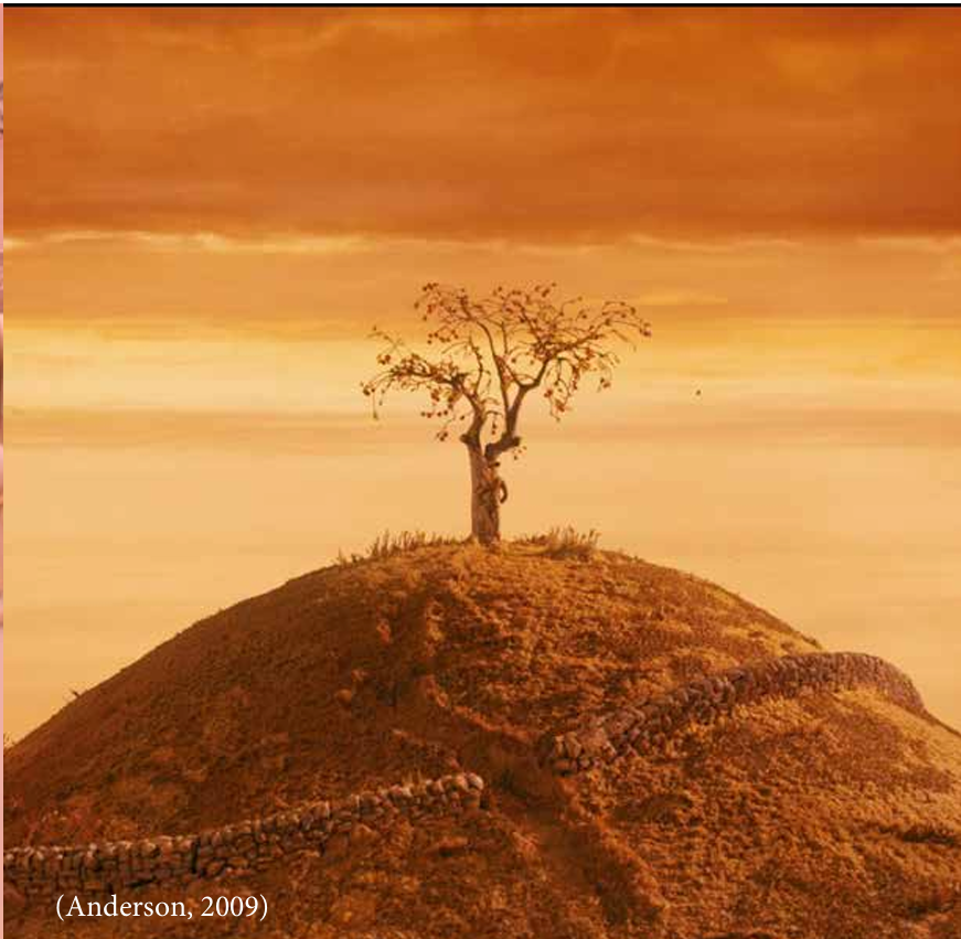
My research explored the fascinating link between color terminology and perception. I delved into historical color classifications, from the naturalistic systems of the past to the subjective world of Pantone's Color of the Year. This journey revealed that most color references stem from nature, shaping our emotional response to different hues. However, film analysis showed how these "general meanings" can become far more nuanced. Viewers can interpret colors individually, prompting filmmakers to use additional elements like characters and lighting to guide the audience towards a specific emotional response.
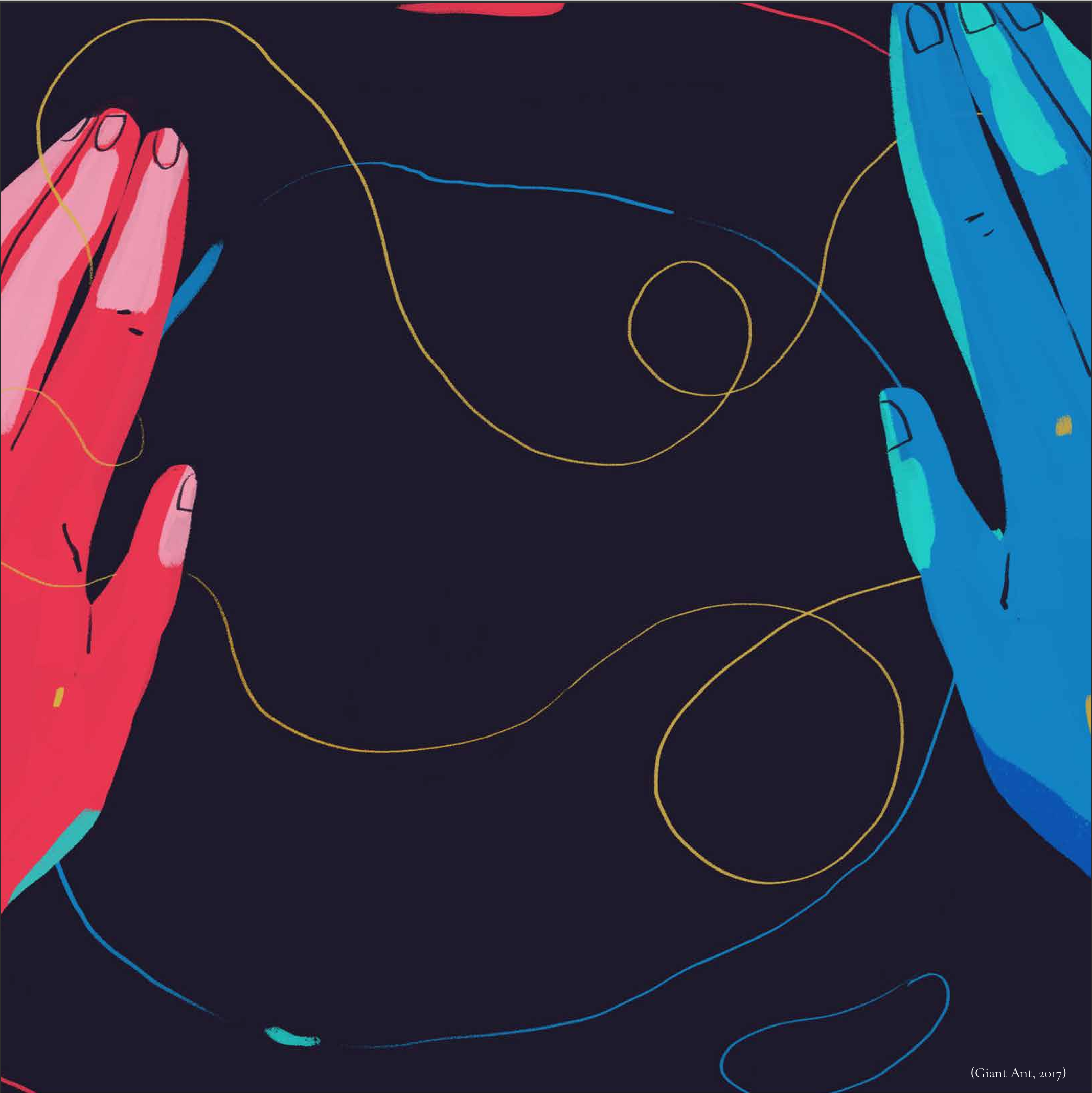
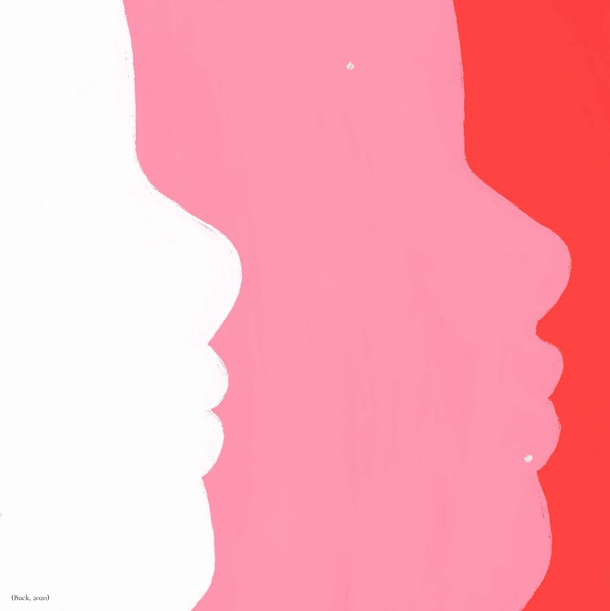
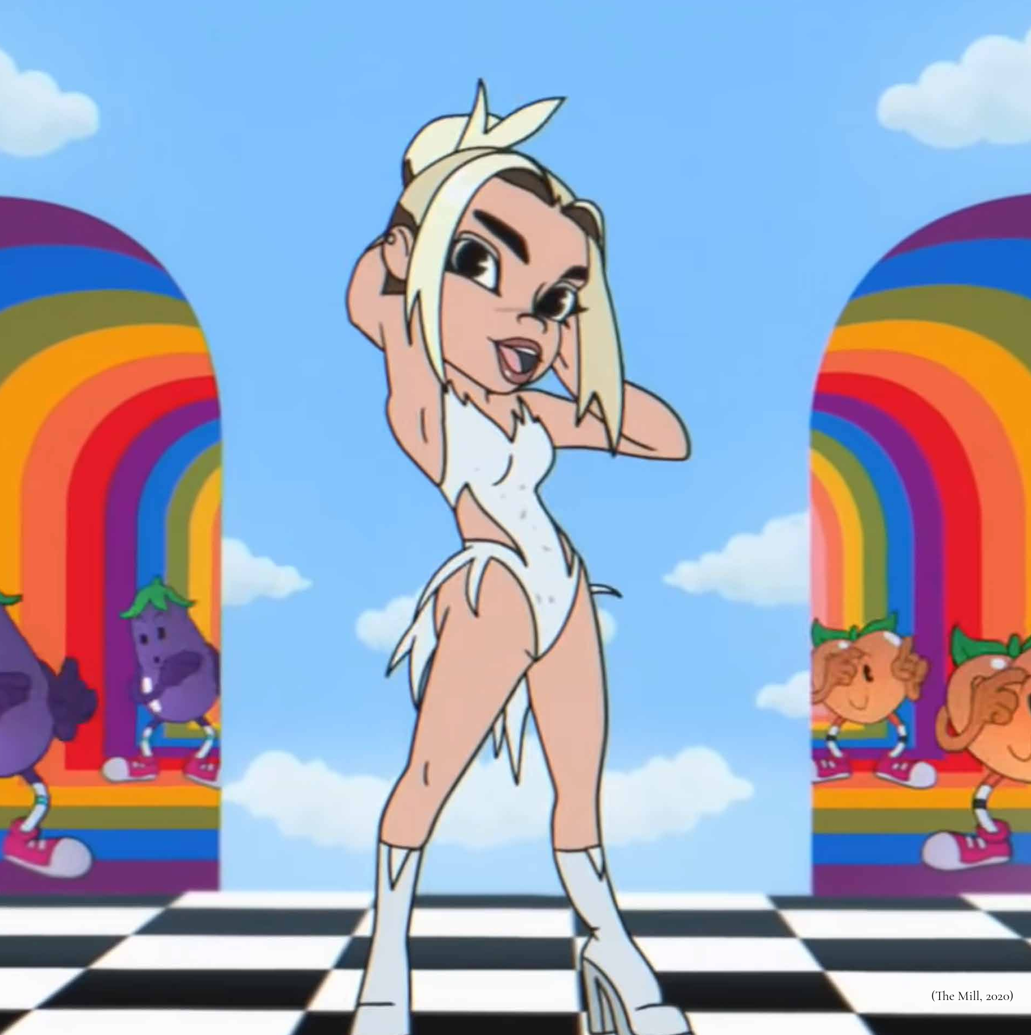
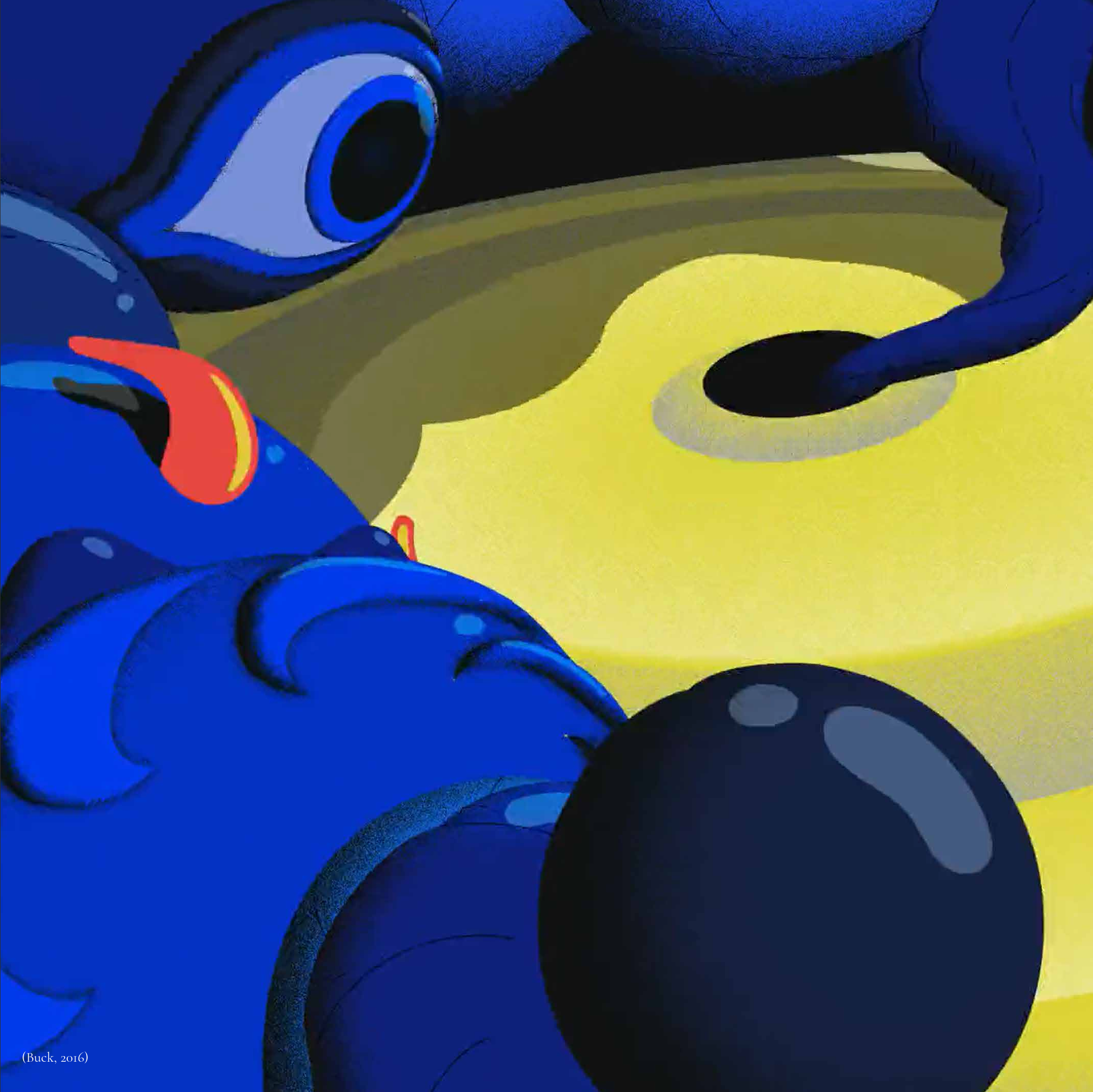
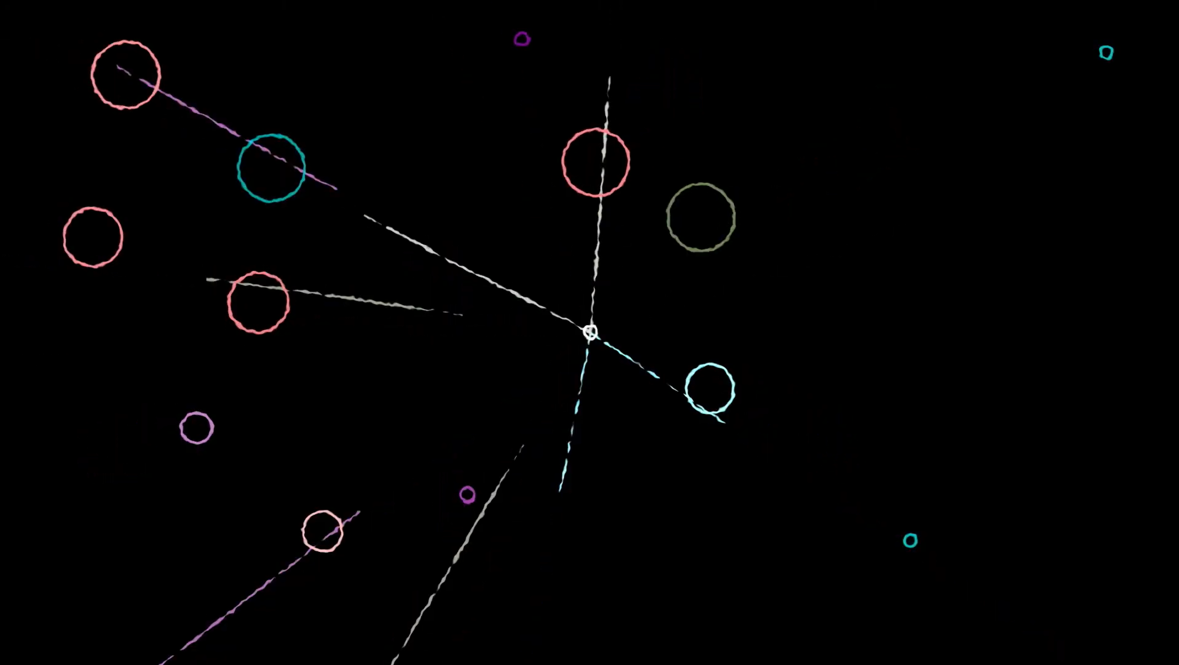
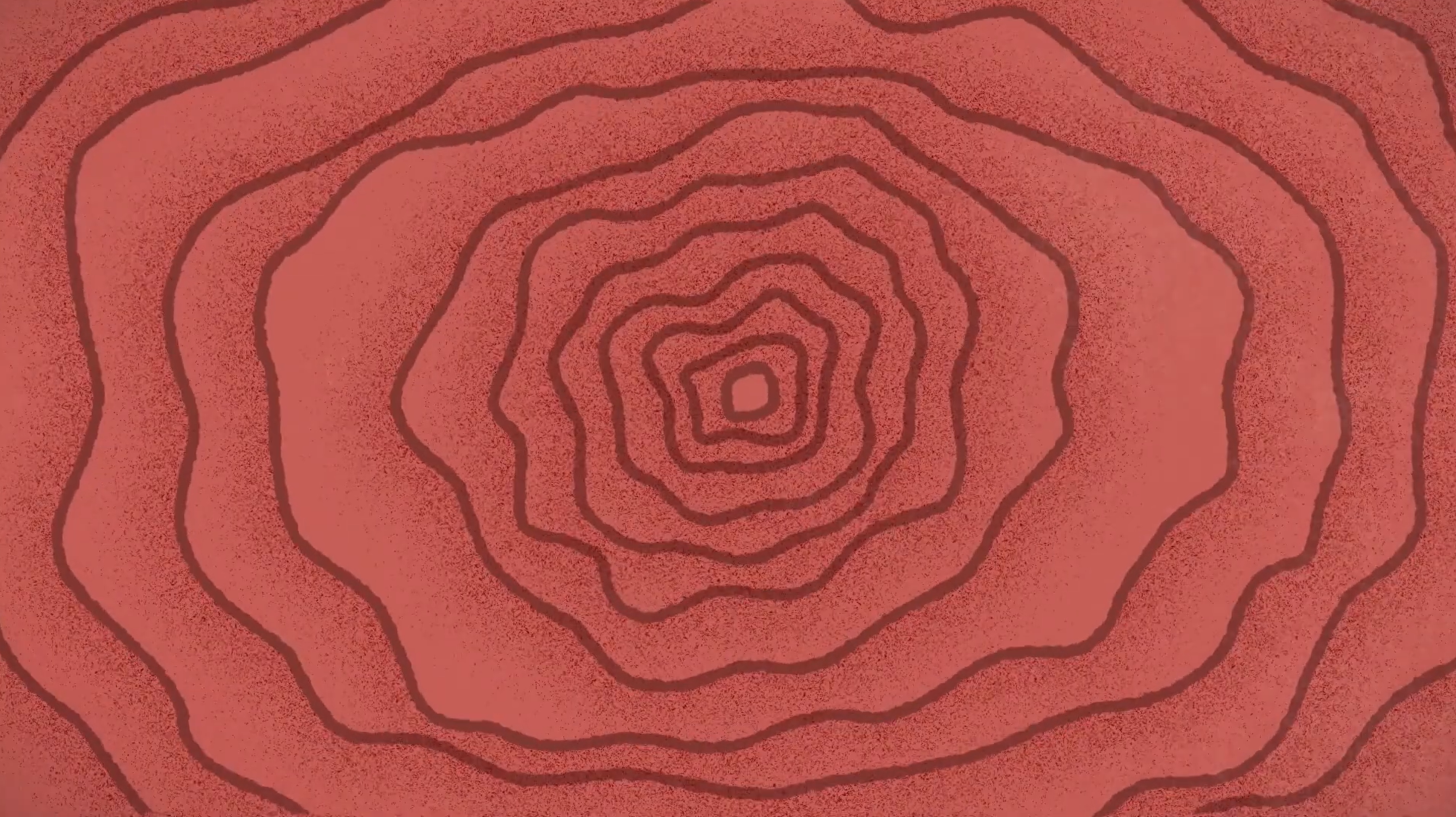
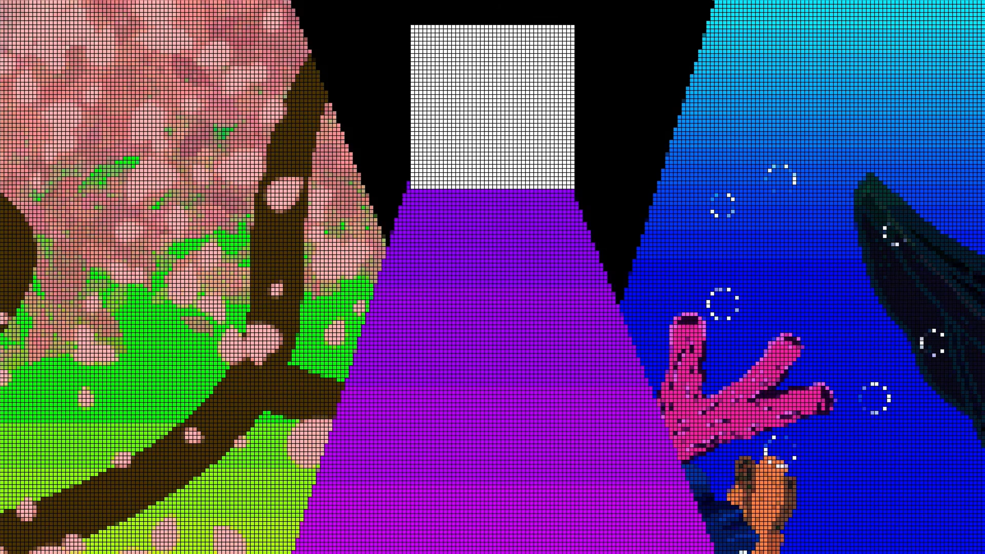
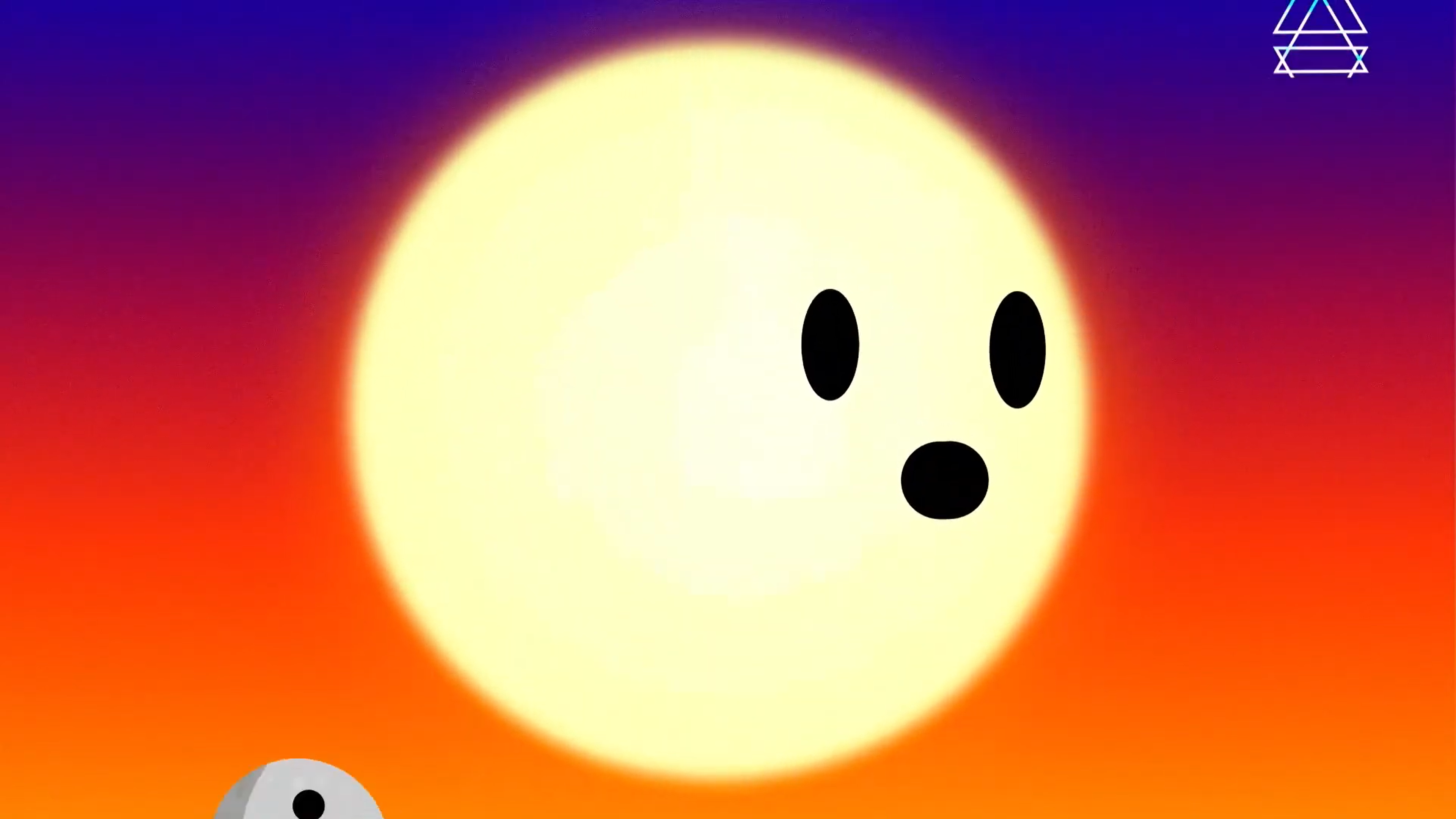
Inspired by my research, I embarked on a unique challenge: crafting a story entirely through color. With time constraints and the need to learn After Effects on the fly, I decided to tell my own story, each stage of life marked by a distinct style and color palette. To capture the essence of these stages (baby, child, teenager, adult), I sought out evocative references that can be seen above.
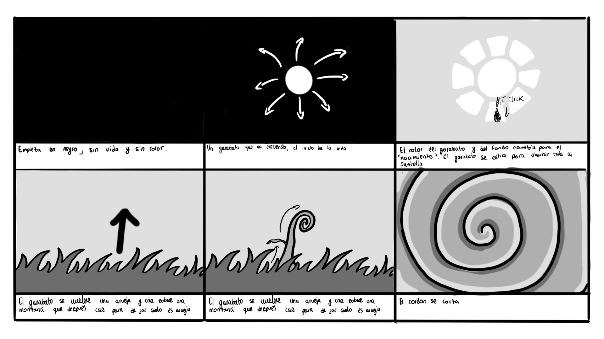
My initial storyboards aimed to capture the emotions of each life stage. However, upon reflection, they felt impersonal. It was my story, and something crucial was missing: the essence of me and the experiences that shaped each phase. Plus, crafting a color-focused animation without color seemed counterintuitive. Recognizing this, I dove into a new set of storyboards, embracing color and injecting them with a deeper emotional core.
My next storyboard draft showed promise. Color flowed freely, and specific life experiences peeked through the narrative. However, the visual style lacked cohesion. My initial inspiration, the wealth of references I'd gathered, was absent. Additionally, some storyboard elements exceeded my current After Effects and animation skills. Taking a new approach, I crafted another storyboard that balanced the richness of my references with my technical capabilities
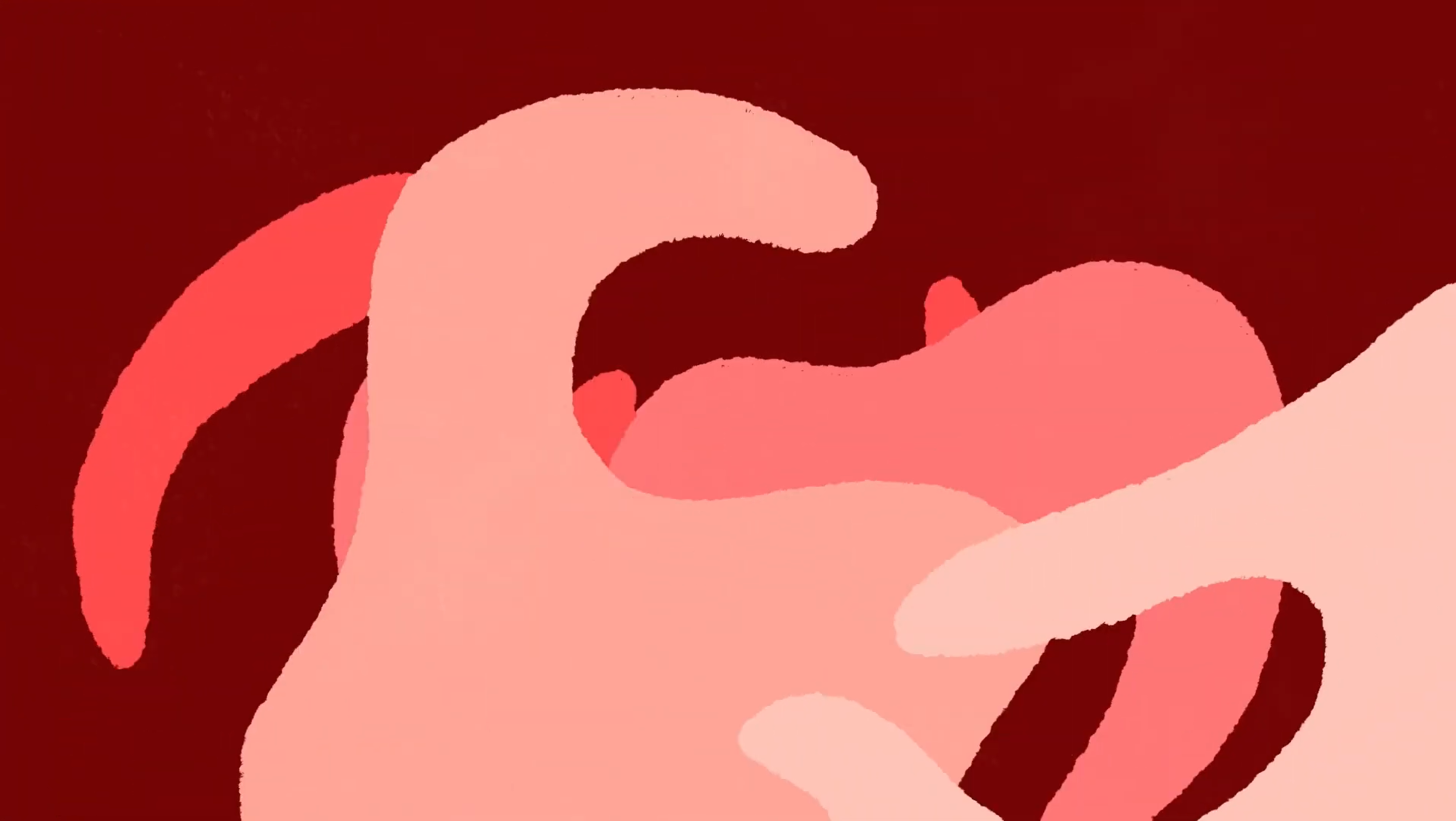


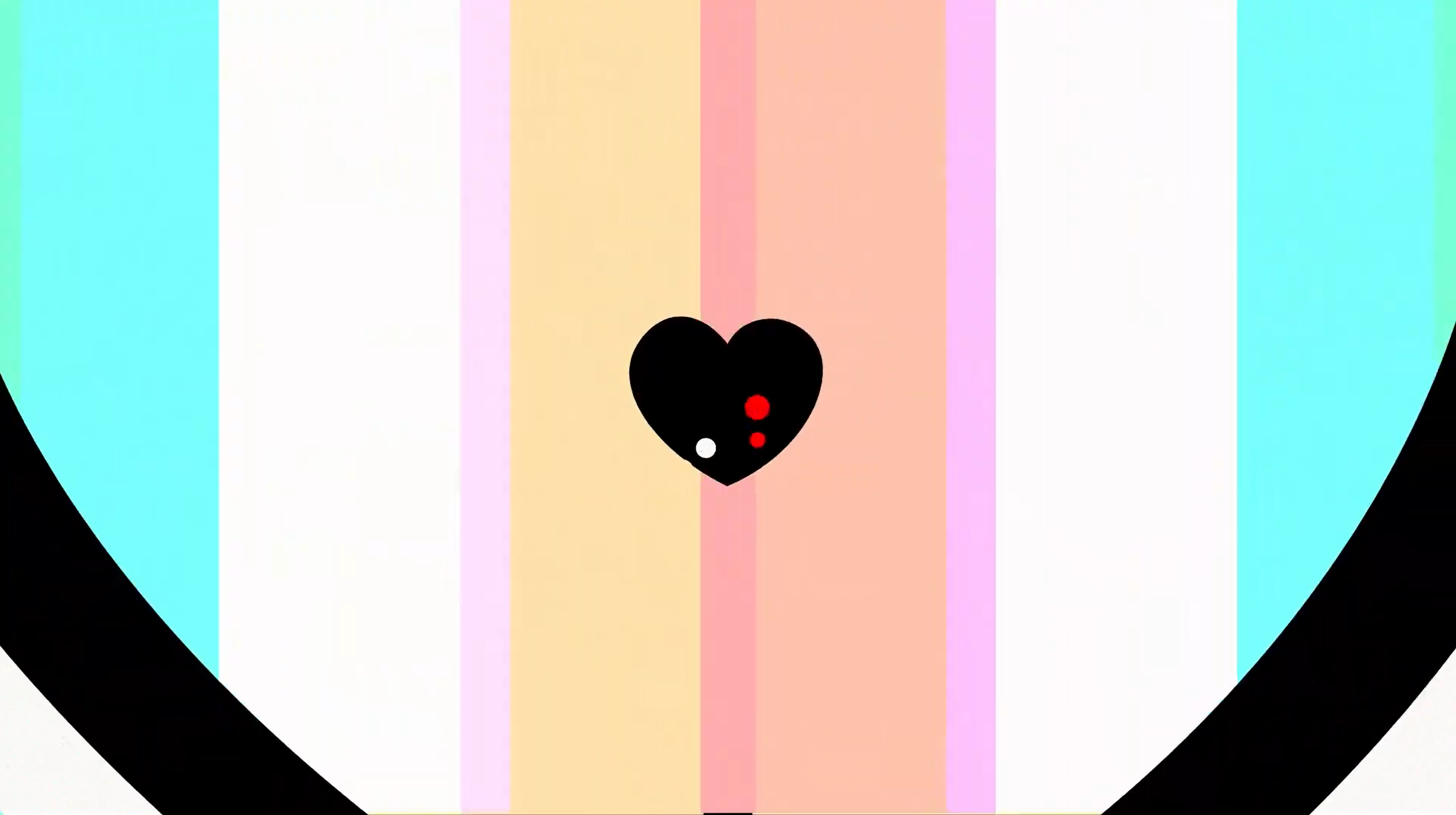
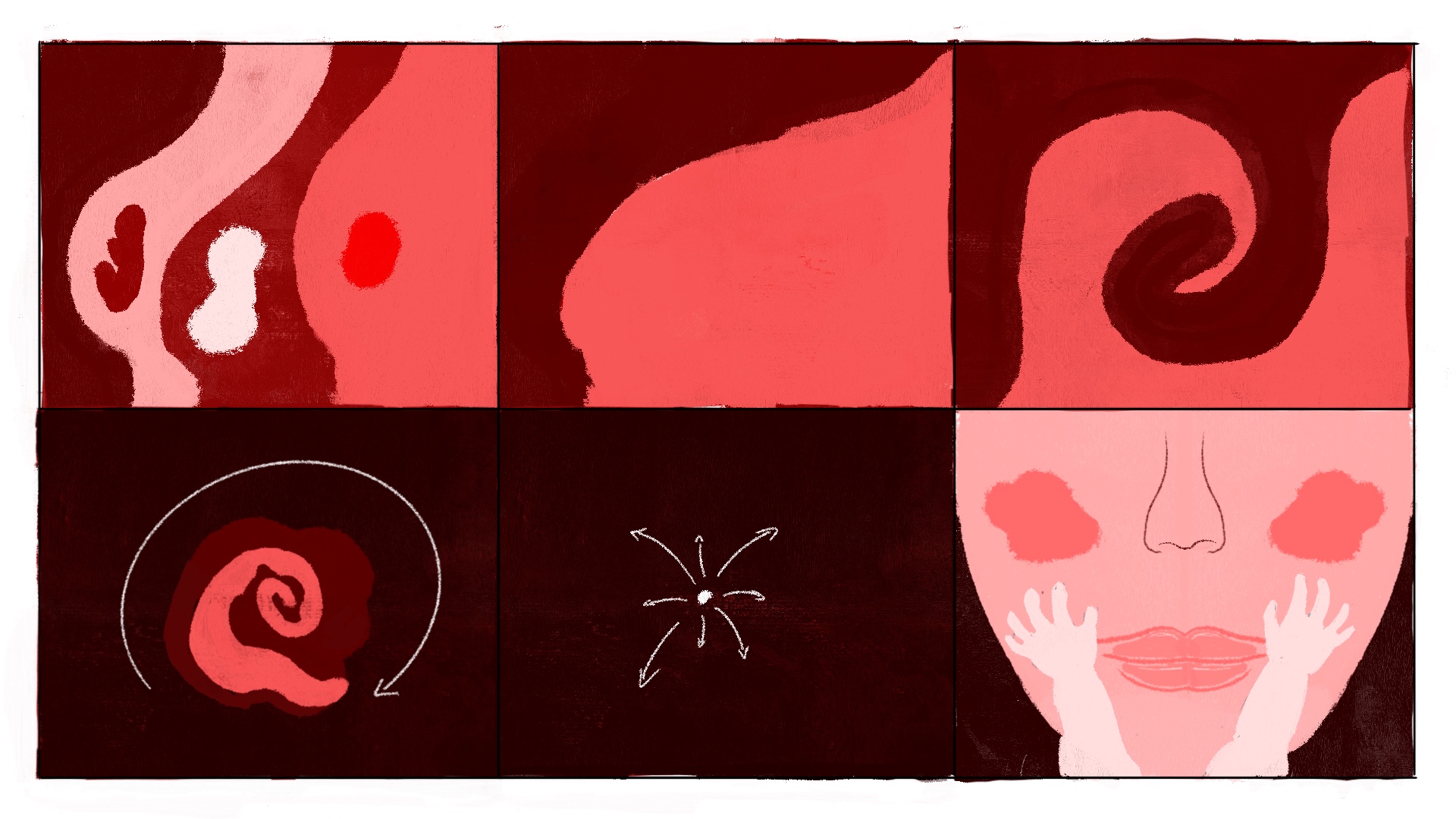
The third storyboard iteration became the blueprint for the final animation. It incorporated elements from my life experiences while staying true to my technical capabilities and the project deadline. To bring this colorful story to life, I collaborated with a talented team who assisted with animation, music, and sound design. Together, we crafted a captivating experience that used color as the central character, with every element designed to support its narrative. Learn more about this process in the e-book below.
Learnings
Quality over quantity: A shorter animation could have allowed me to make more meaningful decisions on what would really support the whole narrative.
Complexity of color: Color is an ever expanding field of study that I need to study further for a next iteration of this project.
Specificity: Meaning and emotions are derived by specificity, a narrative that tries to appeal to everybody, will appeal to nobody.