Safe Search
Safeguarding your online experience.
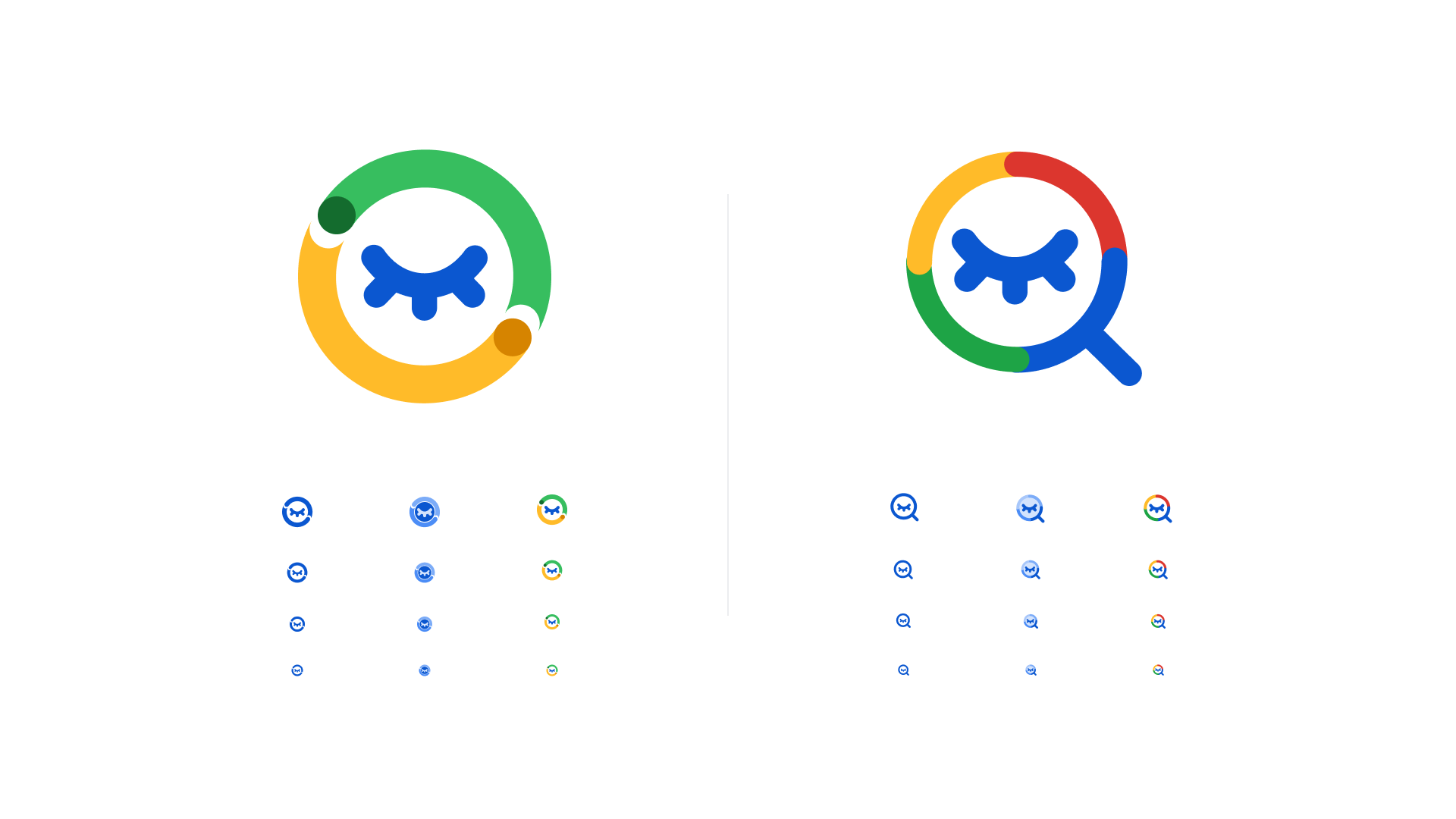
To seamlessly integrate with the existing Google product ecosystem, I referenced established iconography from popular and successful Google products. This exploration resulted in a range of concepts utilizing diverse visual elements, including both the classic Google 4-color palette and single-color options for a more streamlined look.


After a thorough evaluation of the initial explorations, some concepts fell short in conveying either the context of SafeSearch within the interface or the core idea of protection. I then refined the most promising options, iterating on them to arrive at the final proposals, which are presented here in various sizes.
The initial proposals explored the context of SafeSearch. One concept utilized a magnifying glass, a familiar symbol for searching, subtly suggesting that SafeSearch helps users find safe content. The other proposal leaned into the concept of protection. Here, Google's signature circles orbited the eye, creating a visual barrier against inappropriate content.
Learnings
Iconography should be clear in its concept and its context to function properly and communicate accordingly.
Choosing references is important. That a brand released a design, it doesn't mean that the design is automatically good.
Adding color to an icon looks good, but its best used sparingly as in smaller sizes it can become a hindrance to visibility.