OneHuge
Streamlining onboarding & empowering new hires
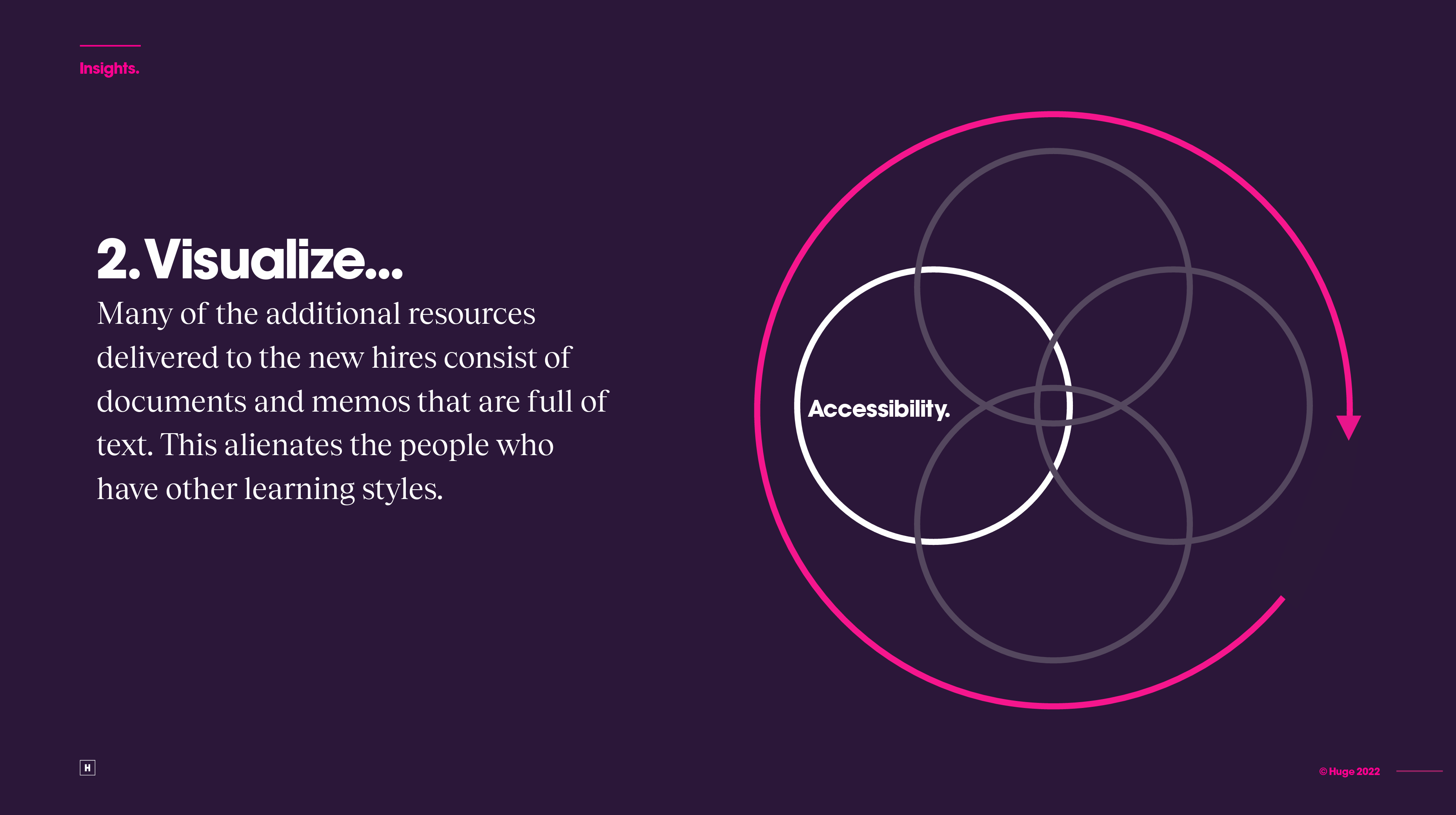
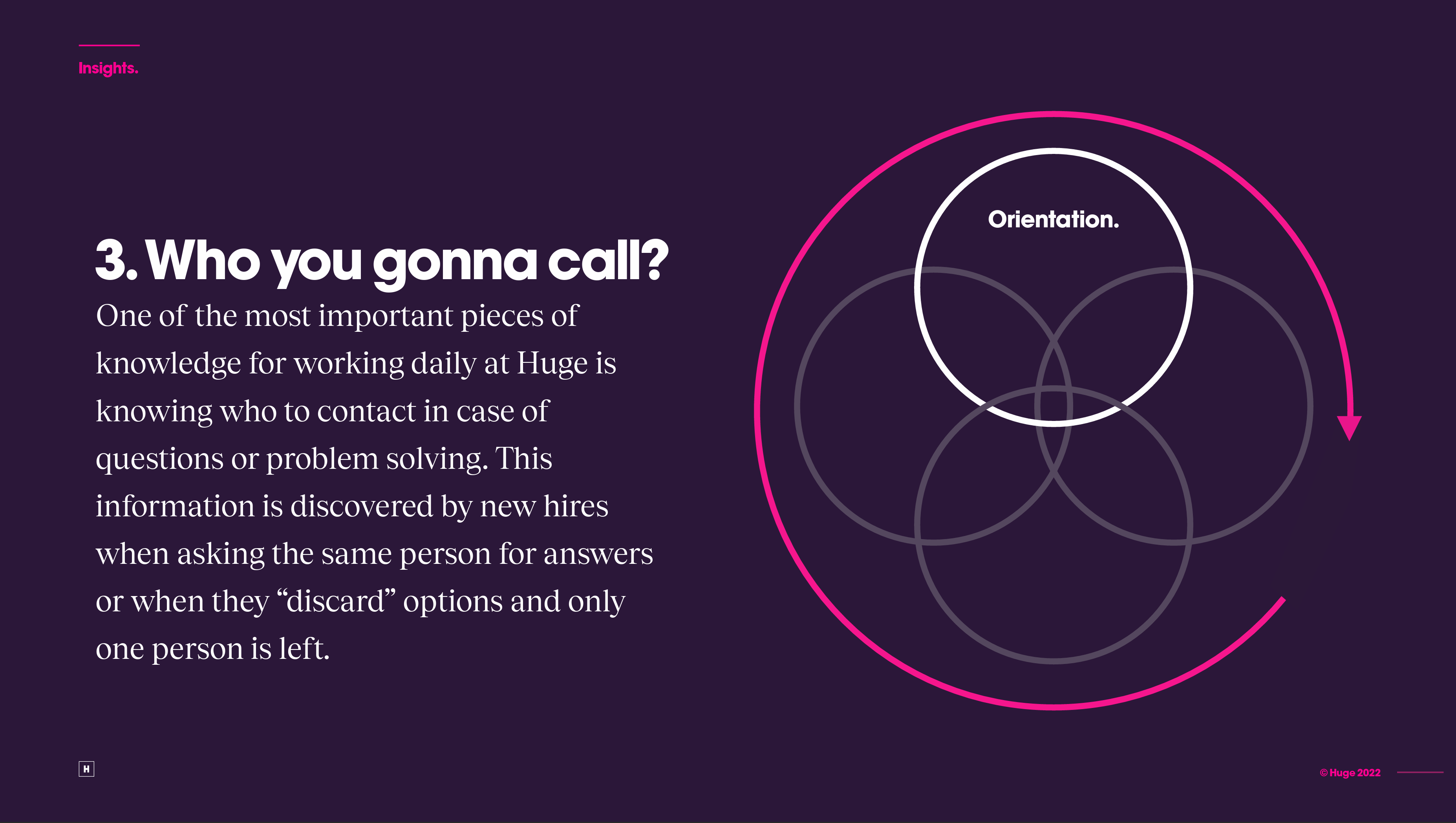
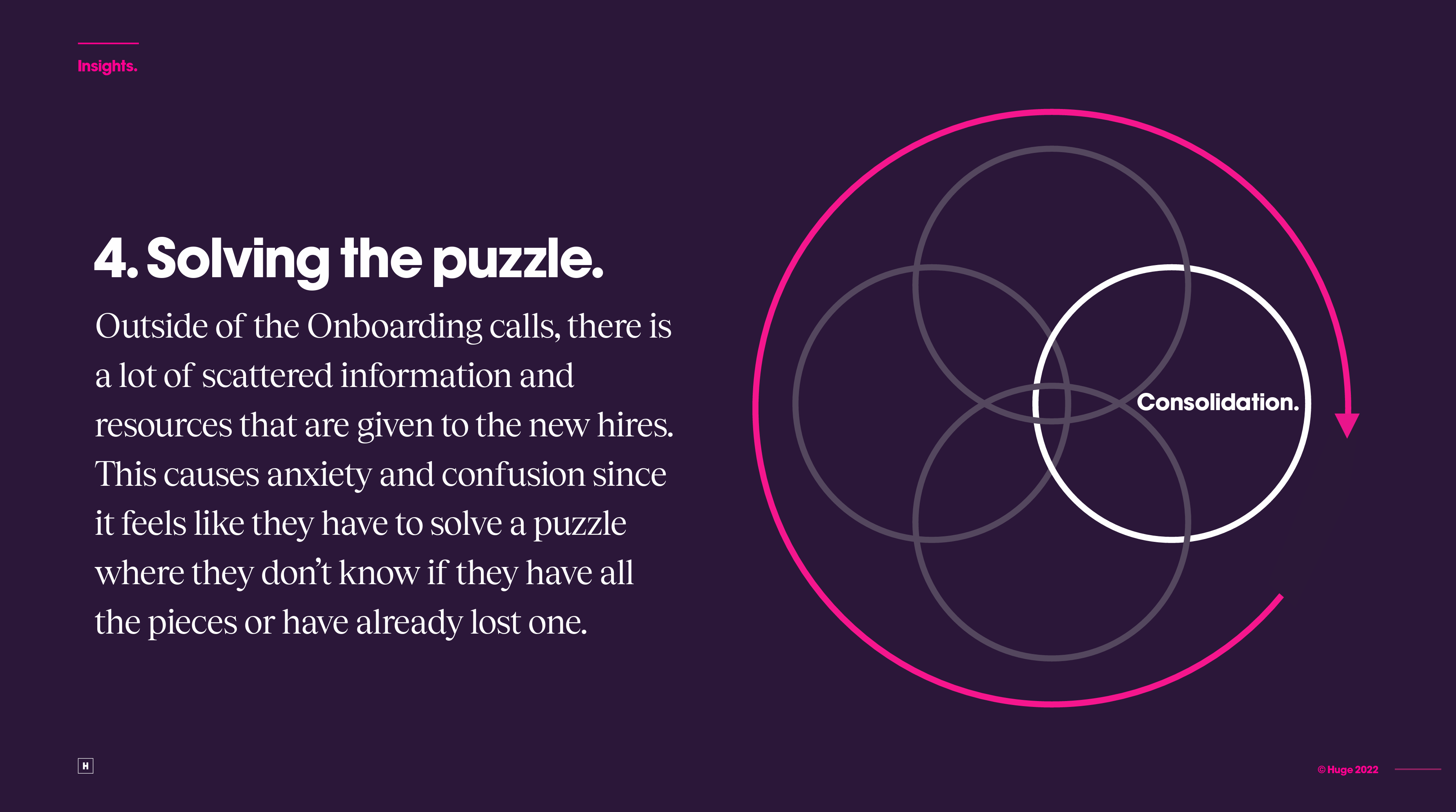
At Huge, new hires embark on a 1-2 week information blitz, covering every department, internal protocols, company history, and benefits. This deluge of knowledge, delivered primarily through video meetings and slide decks, often leaves new hires overwhelmed and anxious. Scattered information makes retention difficult, and dependence on presentations and presenters creates a knowledge gap. With this in mind, I started looking into specific pain points during the process and how new hires adapted after 2 months in their roles.
"I was really anxious because I have ADHD and it was so much information. I was just starting and couldn't understand timesheets..."— Maria Camila Daza, Senior Visual Designer
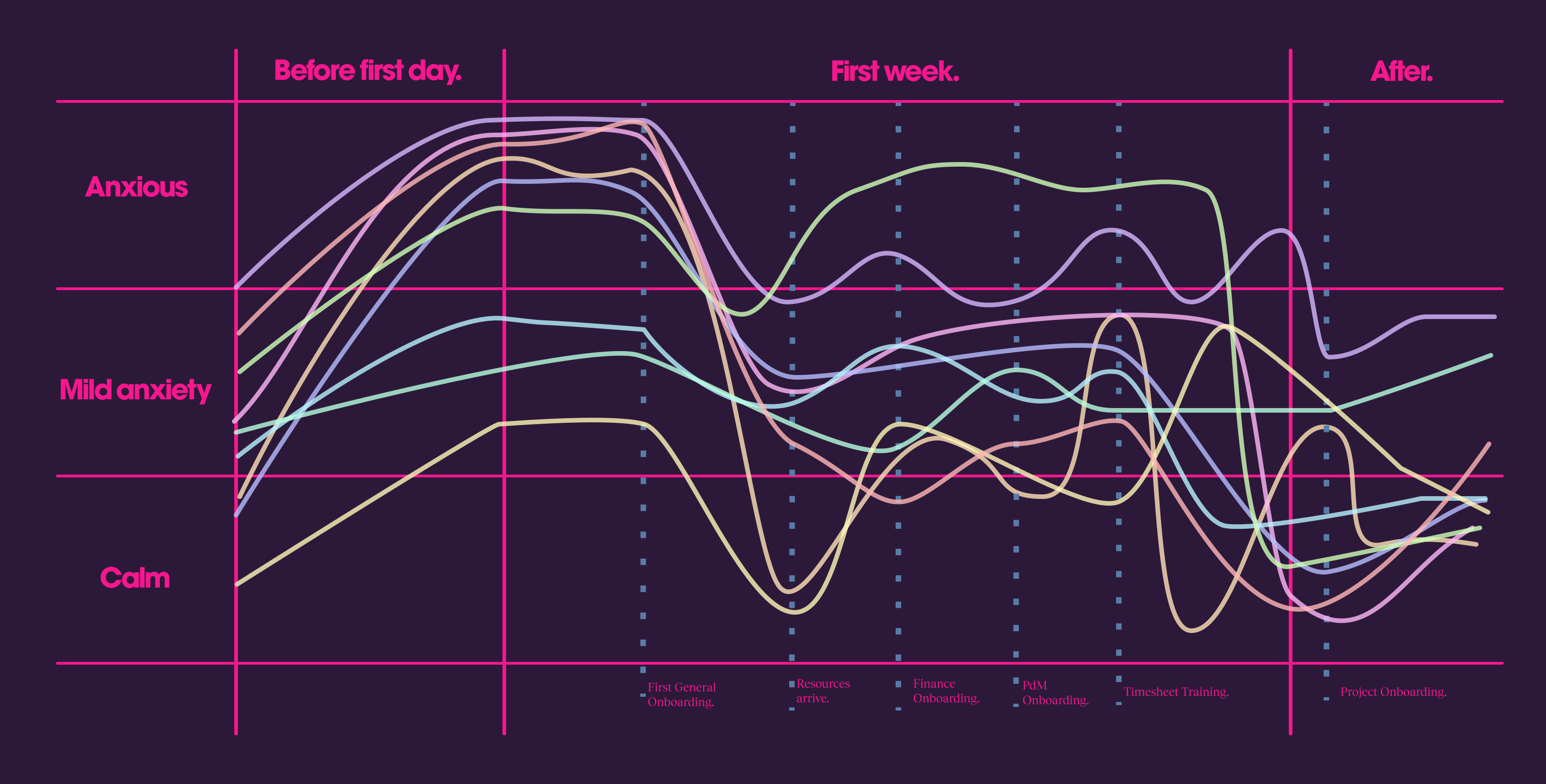
To pinpoint the exact pain points within Huge's onboarding process, I conducted in-depth interviews with three rounds of new hires. This research focused on mapping their anxiety levels throughout the program, particularly at key milestones. By analyzing factors like information accessibility, comprehension, and delivery engagement, I was able to identify the areas causing the most frustration and hindering knowledge retention.
To gain a holistic understanding of Huge's onboarding challenges, I complemented my user interviews with additional research. First, I cross-referenced the content of each onboarding presentation with the information needs of new hires two months post-onboarding. This helped identify discrepancies between what was delivered and what was actually retained. Second, I interviewed experienced employees to understand the most frequently requested information and the core takeaways from each onboarding session. By focusing on knowledge retention, recurring information needs, and intended learning outcomes, I was able to further refine my understanding of the onboarding experience's effectiveness.
My initial research yielded a wealth of valuable data, but I still lacked the key to solving the problems with the onboarding process. So, I returned to the drawing board and conducted additional rounds of interviews. Through these follow-up discussions, I identified a crucial missing piece: the lack of a cohesive onboarding story. Despite departmental efforts to organize their onboarding materials, the overall experience lacked a unifying narrative. This fragmented approach made it difficult for new hires to navigate the information and ultimately understand the "bigger picture" of their roles.
Armed with these insights, I charted a course to streamline and optimize Huge's onboarding process. The solution: a centralized online platform featuring a meticulously crafted content strategy and information architecture. This platform would not only be intuitive and understandable for new hires, but also readily accessible for existing employees. My approach focused on three core pillars:
-
Reduced Anxiety: Calming new hire anxiety through a user-friendly platform.
-
Personalized Learning: Empowering new hires to learn at their own pace and style
-
Unified Knowledge Base: Establishing a single source of truth for onboarding information, accessible to both new hires and existing employees.
To tackle the challenge of information overload, I collaborated with an experienced content strategist. Together, we devised a novel organizational concept for the platform's content. This approach meticulously categorized critical onboarding information for new hires, differentiating it from less frequently accessed materials. By prioritizing essential knowledge, we crafted a content strategy focused on delivering this information in a cohesive, user-friendly manner, ensuring a smooth experience for new hires.
Leveraging the newly developed content organization system, I created two distinct information architecture (IA) diagrams. These diagrams meticulously mapped out the user journey through the platform, catering to different learning styles. One approach offered a guided experience, strategically delivering information based on a new hire's time at Huge. The other prioritized user autonomy, allowing new hires to navigate and learn at their own pace. To ensure the platform's usability and validate the information categorization, I conducted card sorting exercises. This user testing involved all relevant profiles: new hires, individuals two months post-onboarding, and experienced employees. By incorporating their feedback, I refined both the IA and content organization, guaranteeing an intuitive and personalized onboarding experience.
Building upon the refined information architecture, I translated the user journey into a series of wireframes. These wireframes served as a visual blueprint for the platform, allowing for further user testing and iteration. Leveraging a Figma prototype, I conducted a series of user tests where participants navigated the platform to locate specific company knowledge on various topics. By analyzing their interactions and feedback, I was able to identify and address any remaining usability issues. This iterative process culminated in the final, user-tested information architecture, ensuring an intuitive and efficient onboarding experience.
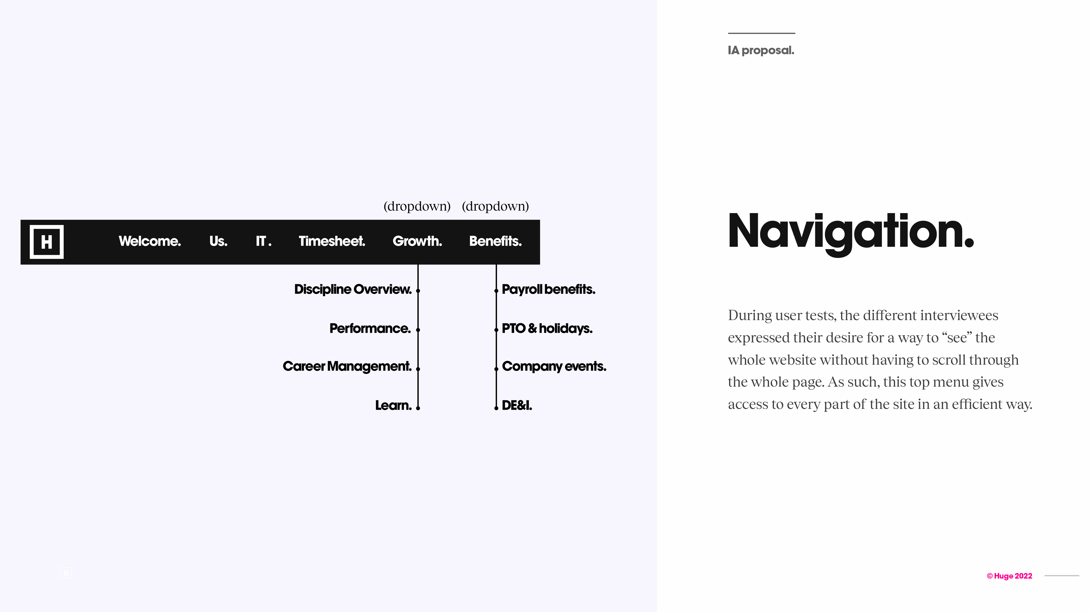
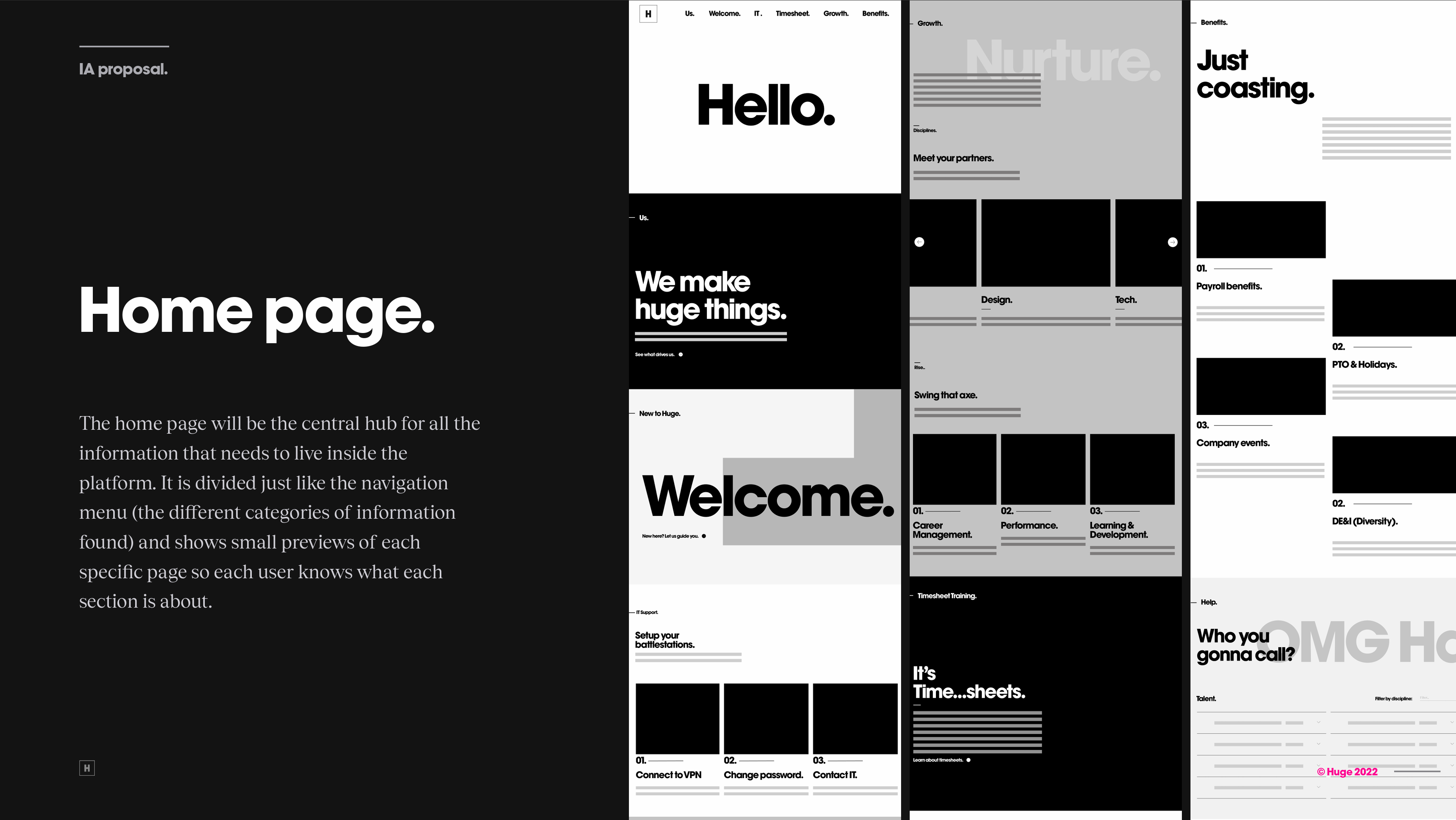
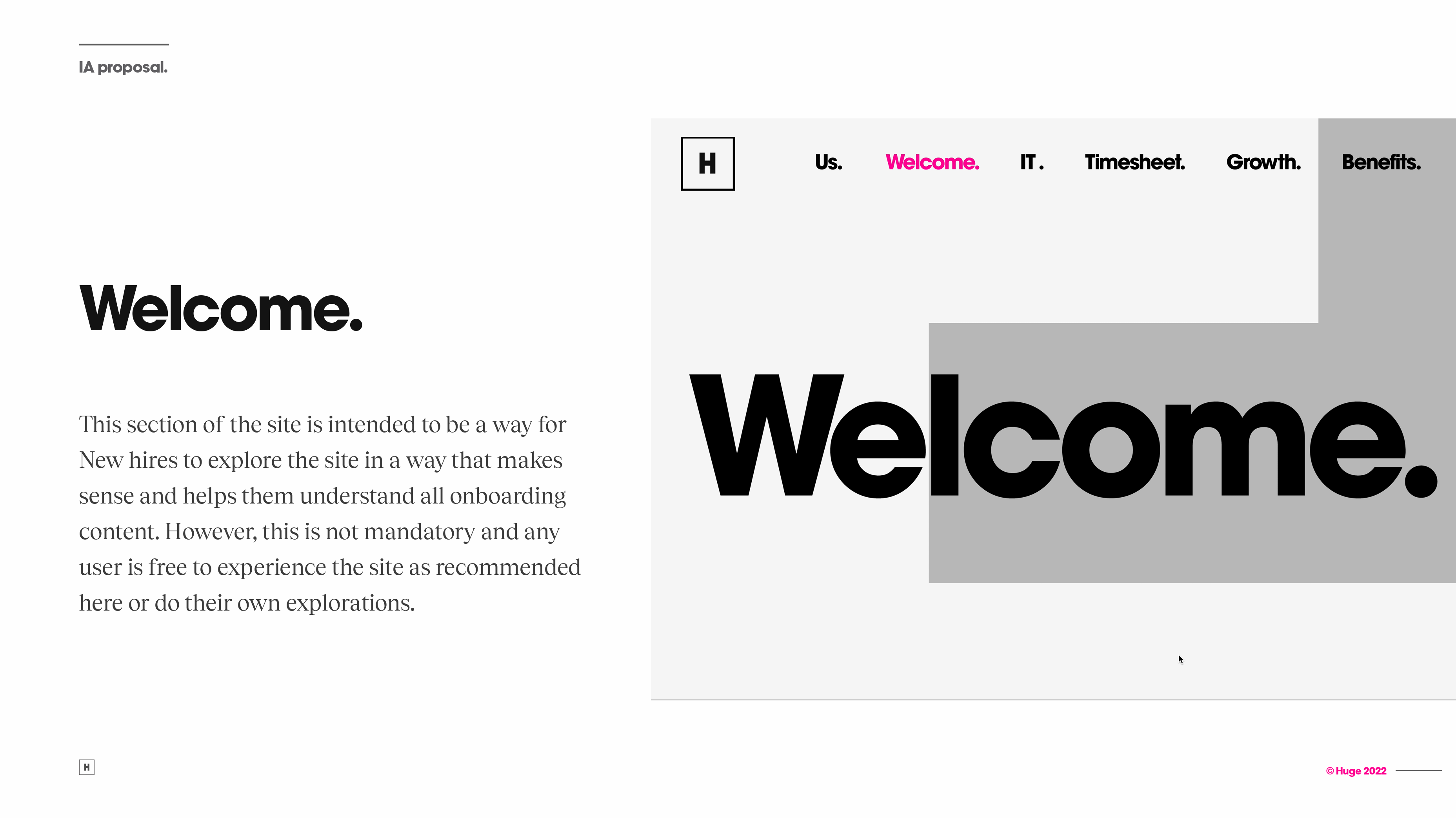
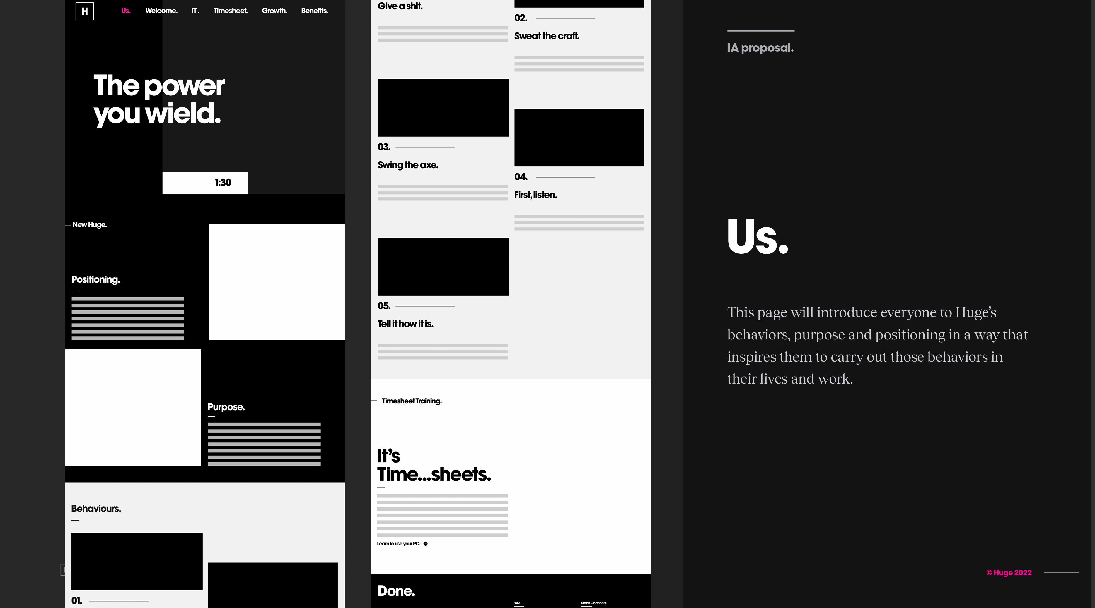
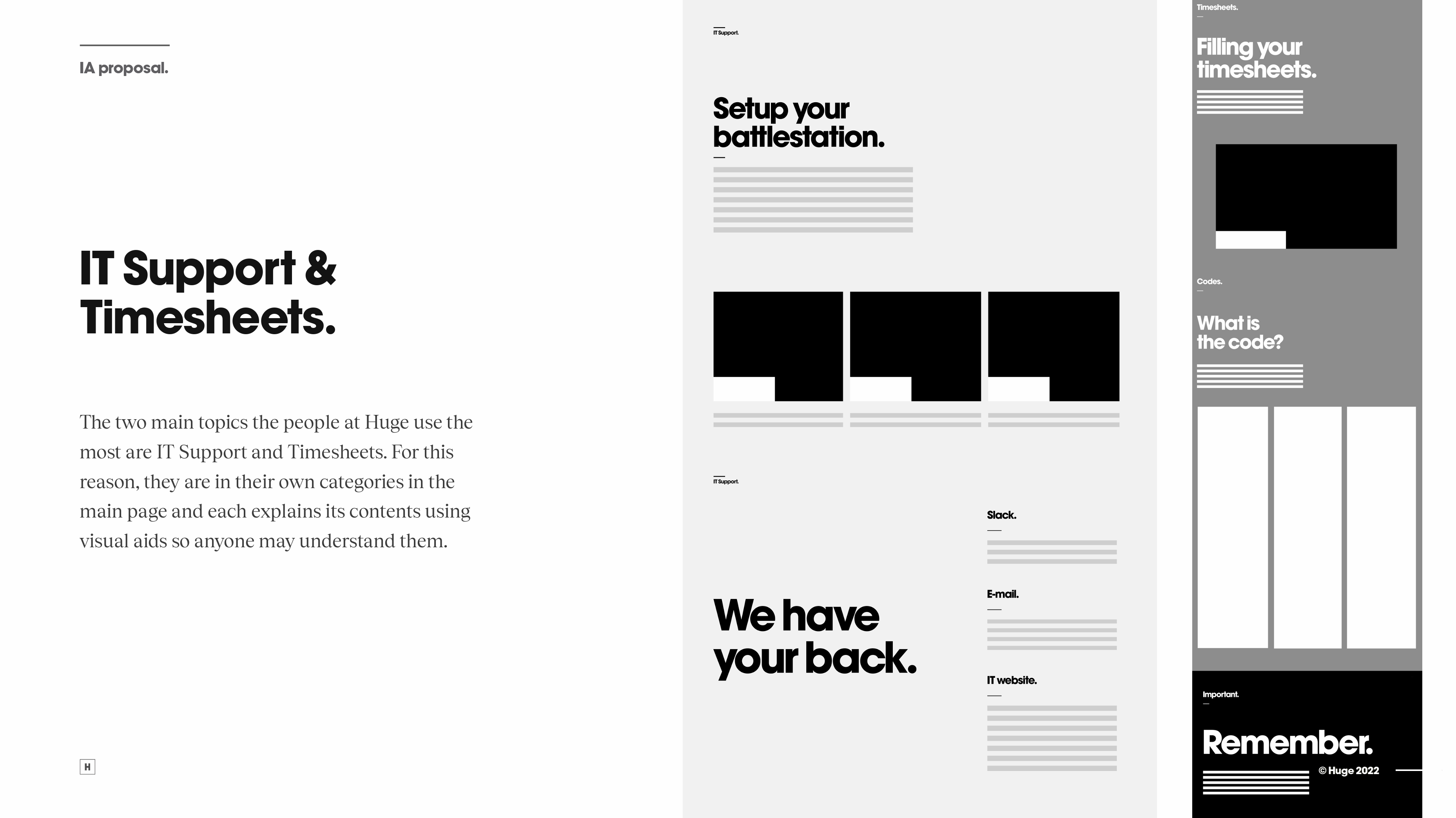
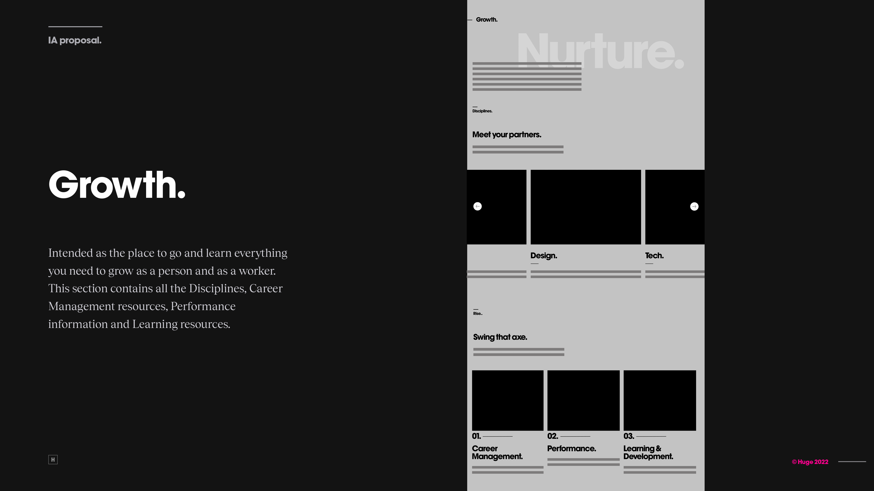
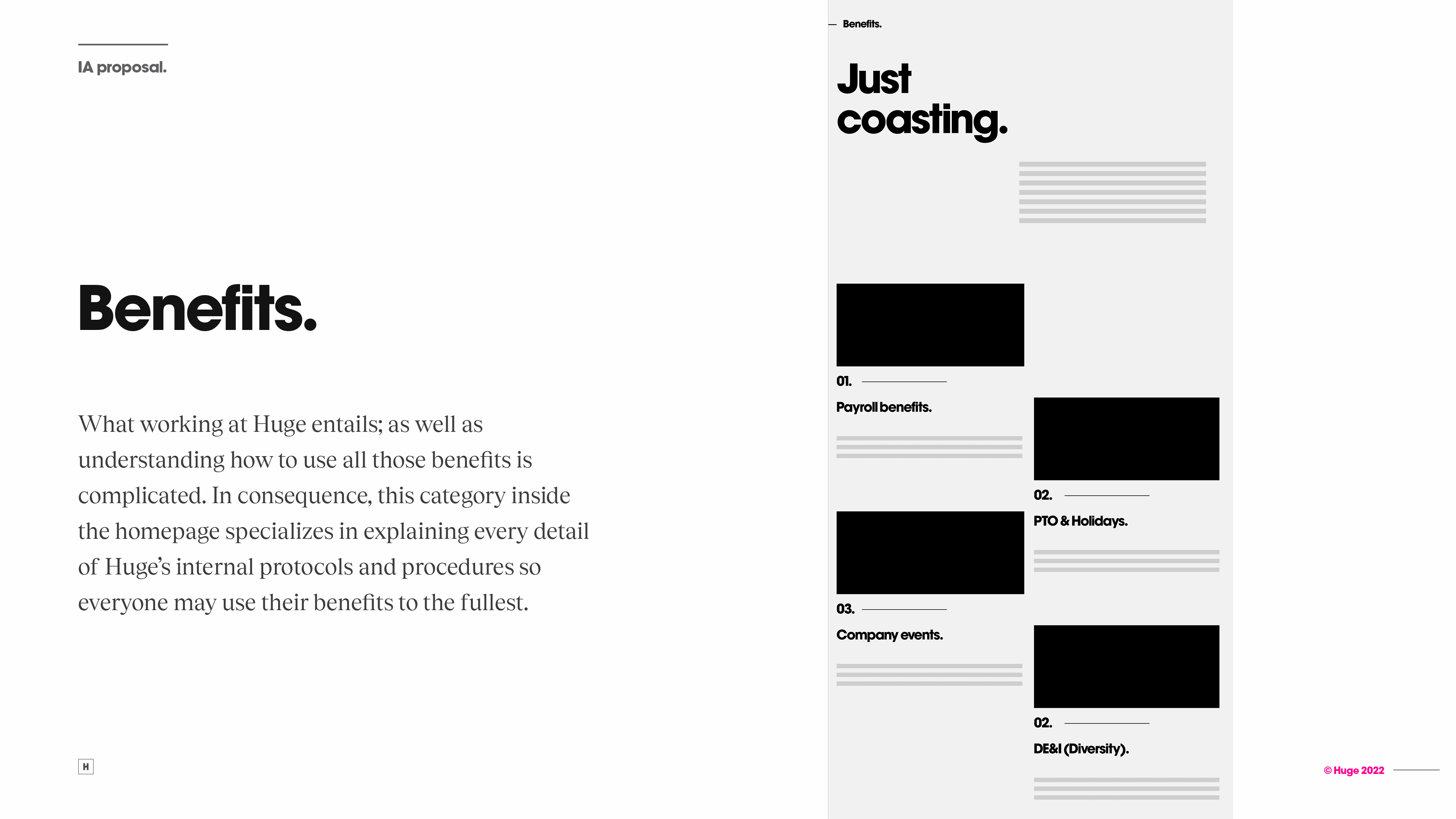
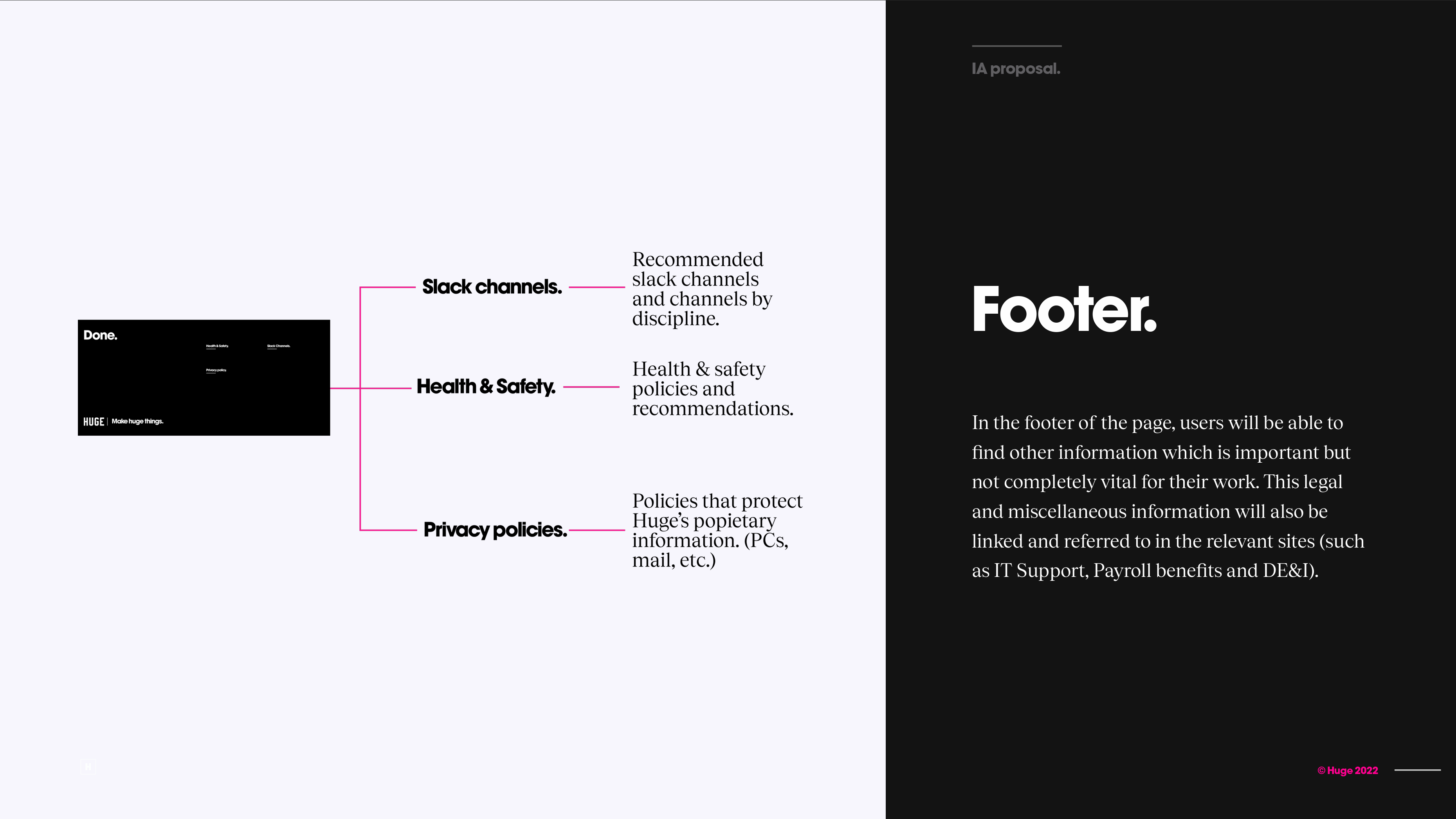
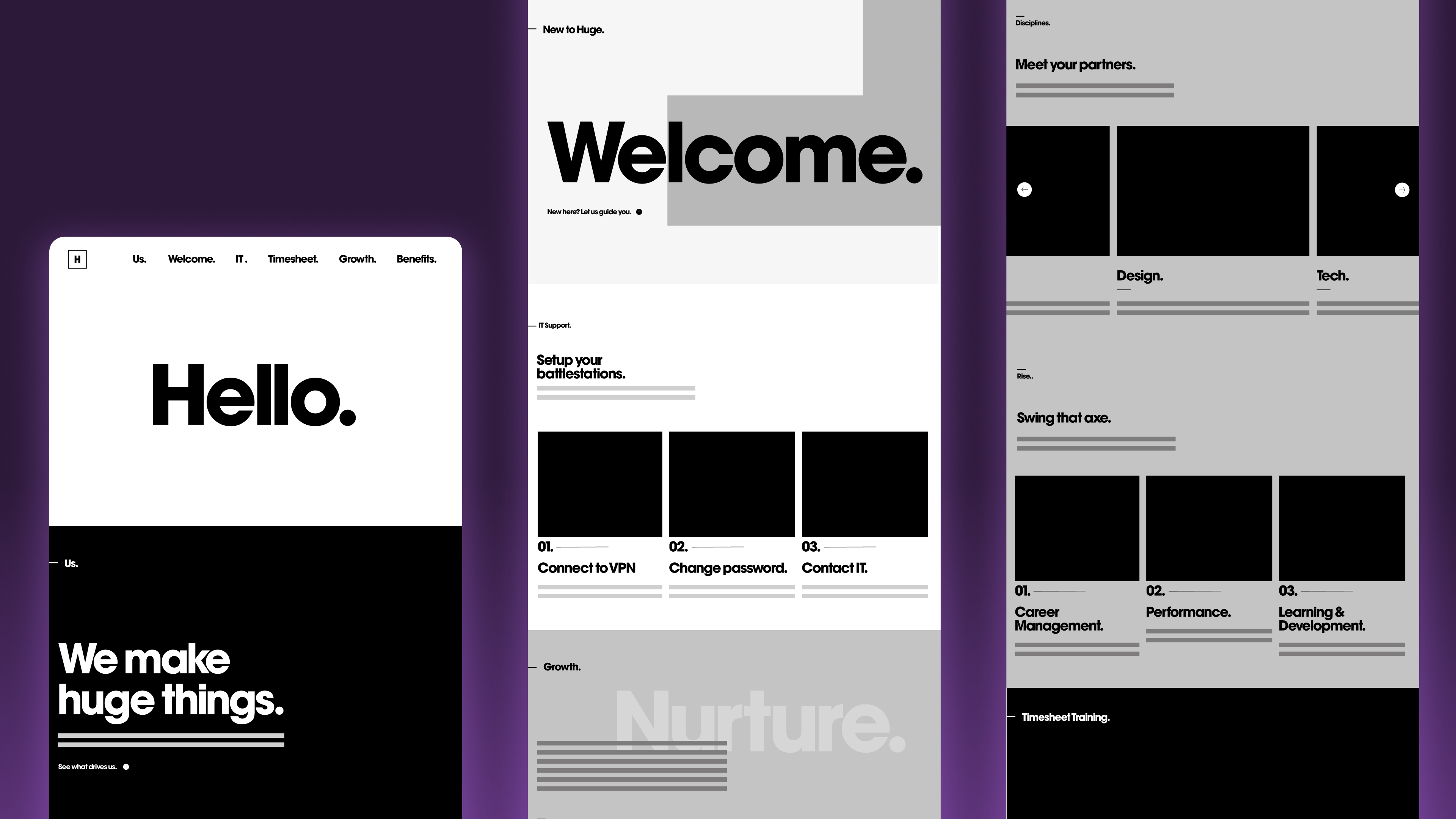
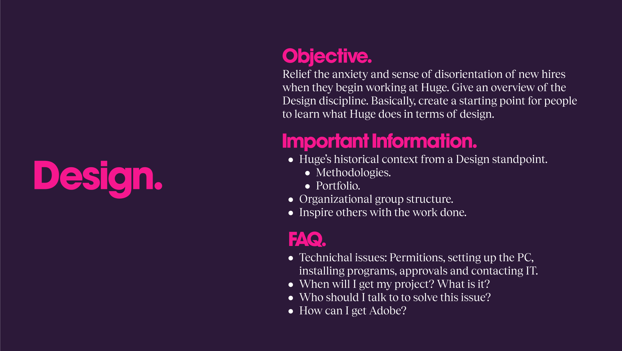
The final information architecture prioritized user needs by dividing content into intuitive subsections based on purpose and importance. This ensured users could easily and intuitively access the information they required. Clear descriptions and connections to every department streamlined access to relevant information. Users could readily locate support for IT and timesheets, access learning materials in Growth, and explore benefits and company policies in the dedicated Benefits section.
Additionally, the Welcome section functioned as a curated tour for new hires, providing a structured learning path for those seeking a more comprehensive introduction to Huge. This meticulously designed information architecture served as the foundational framework upon which Huge launched its global intranet platform.
Learnings
Every decision made when designing an experience has to be backed by user research, and user research is the best tool to solve questions you don't have the answer to.
When conducting research, simple is better when it comes to the resources you create. Allowing more time for active research instead of preparing for it.
It's important to continuously draw conclusions from every research step as this will enable a holistic view of the research results without getting lost in the details.