Huge Pride
Pride Unbound: Celebrating Progress
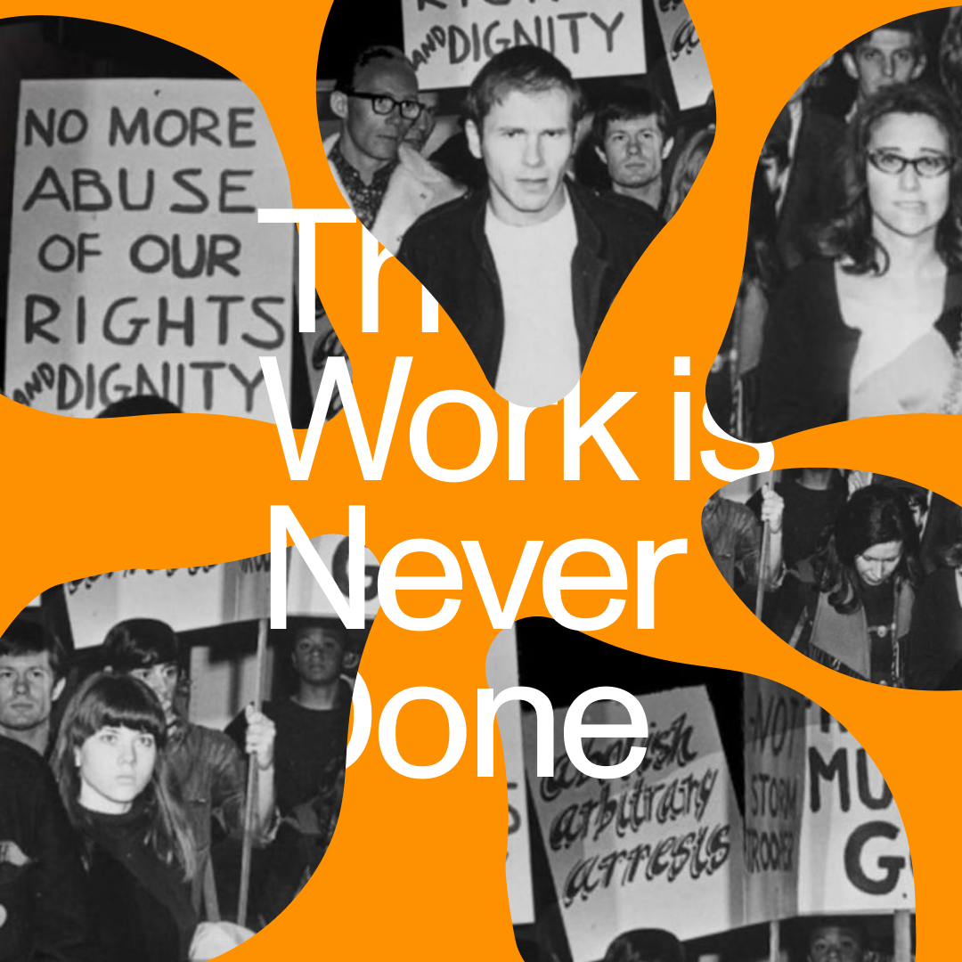
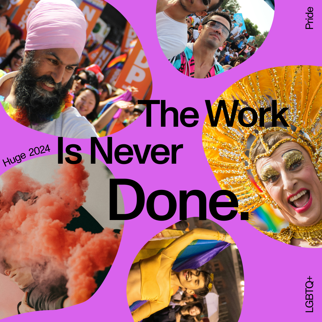
As Pride Month approached, the challenge was to create impactful content for Huge's social media and internal communications channels. Inspired by the DE&I team's 2024 slogan, "The work is never done," I aimed to develop assets that resonated with the LGBTQ+ community's history of ongoing struggle and resilience.
Symbols have always held immense significance for the LGBTQ+ community. Historically, they served as a hidden language for communication and identification. Today, they stand as powerful reminders of past struggles and a vibrant celebration of self-expression. Reflecting this duality, I based many of my concept explorations on these historic symbols and their meanings, while ensuring the visuals transcended our history to represent the movement's expansive present.
Bridging the gap between impactful messaging and brand coherence was key. I ensured all content aligned with Huge's general brand guidelines, while also incorporating the specific creative vision established by the LGBTQ+ affinity group. This involved exploring concepts that utilized the gradients, image styles, and color palettes they had previously defined.
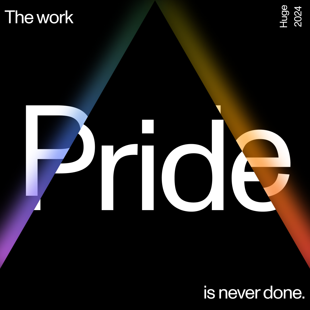
First, I explored the power of symbolism and progress. Simple shapes held powerful meaning. The pink triangle, a symbol of historical suffering and silenced voices, now points upwards representing our ongoing climb for equality. Circles represent the unity of diverse LGBTQ+ communities towards a common goal.
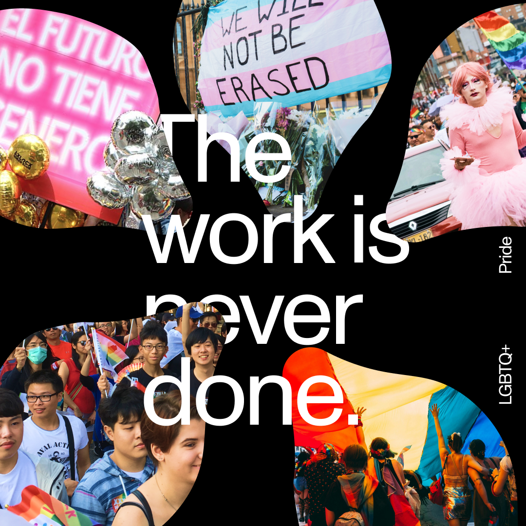
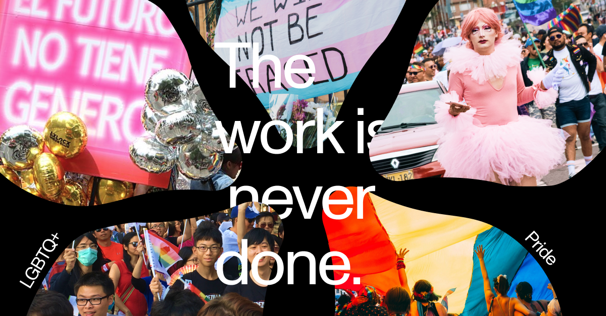
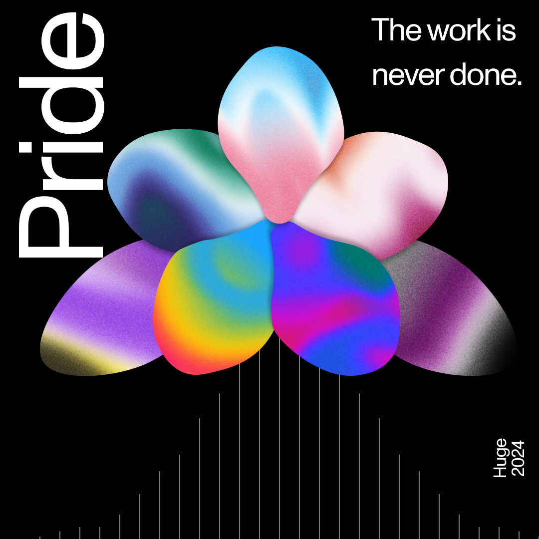
Next, I looked at reclaiming nature. Flowers, once used as coded language and then as a tool for shame, were reappropriated. These concepts explored the LGBTQ+ community building acceptance on a vibrant bed of flowers.
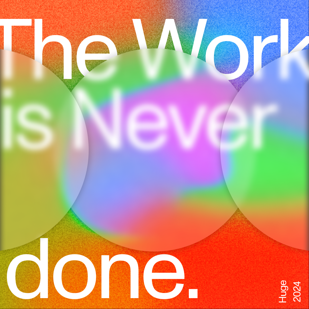
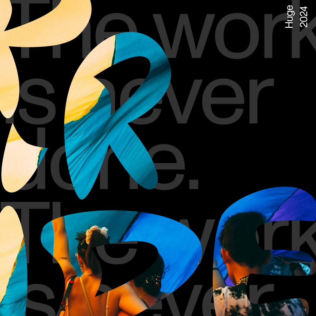
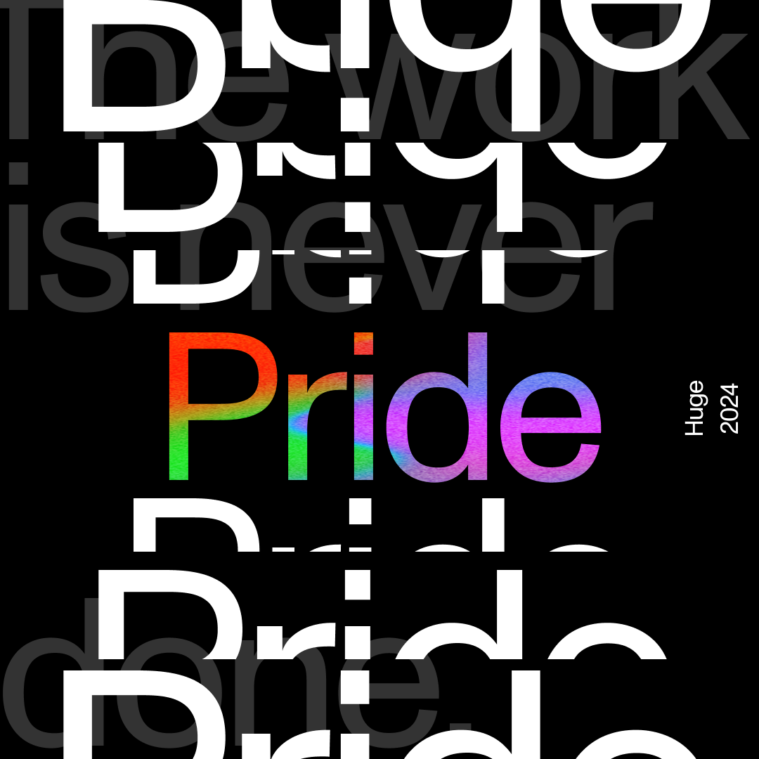
Finally, I considered the power of typography. Language plays a key role in LGBTQ+ culture. This concept explored the power of language to express identity and build community.
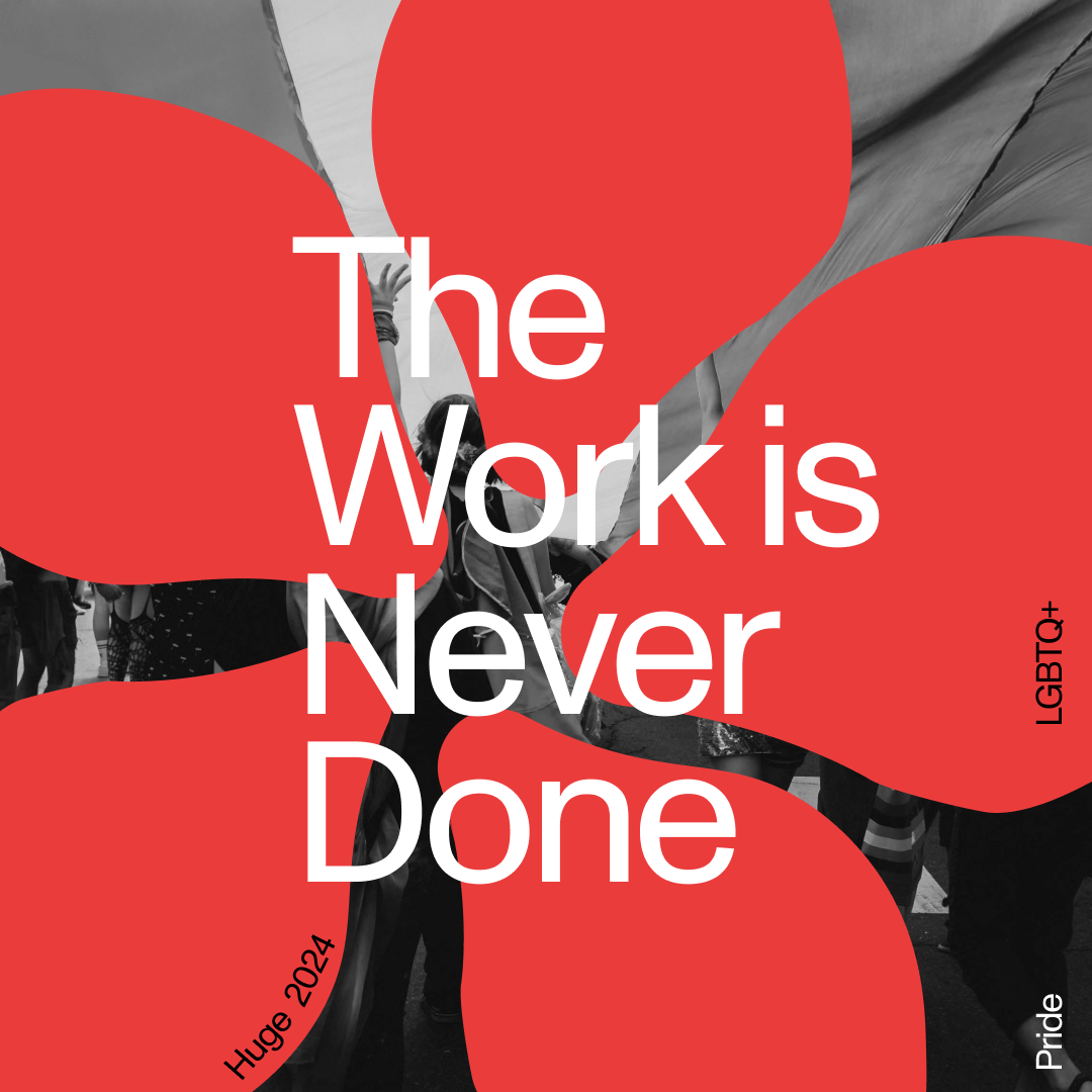
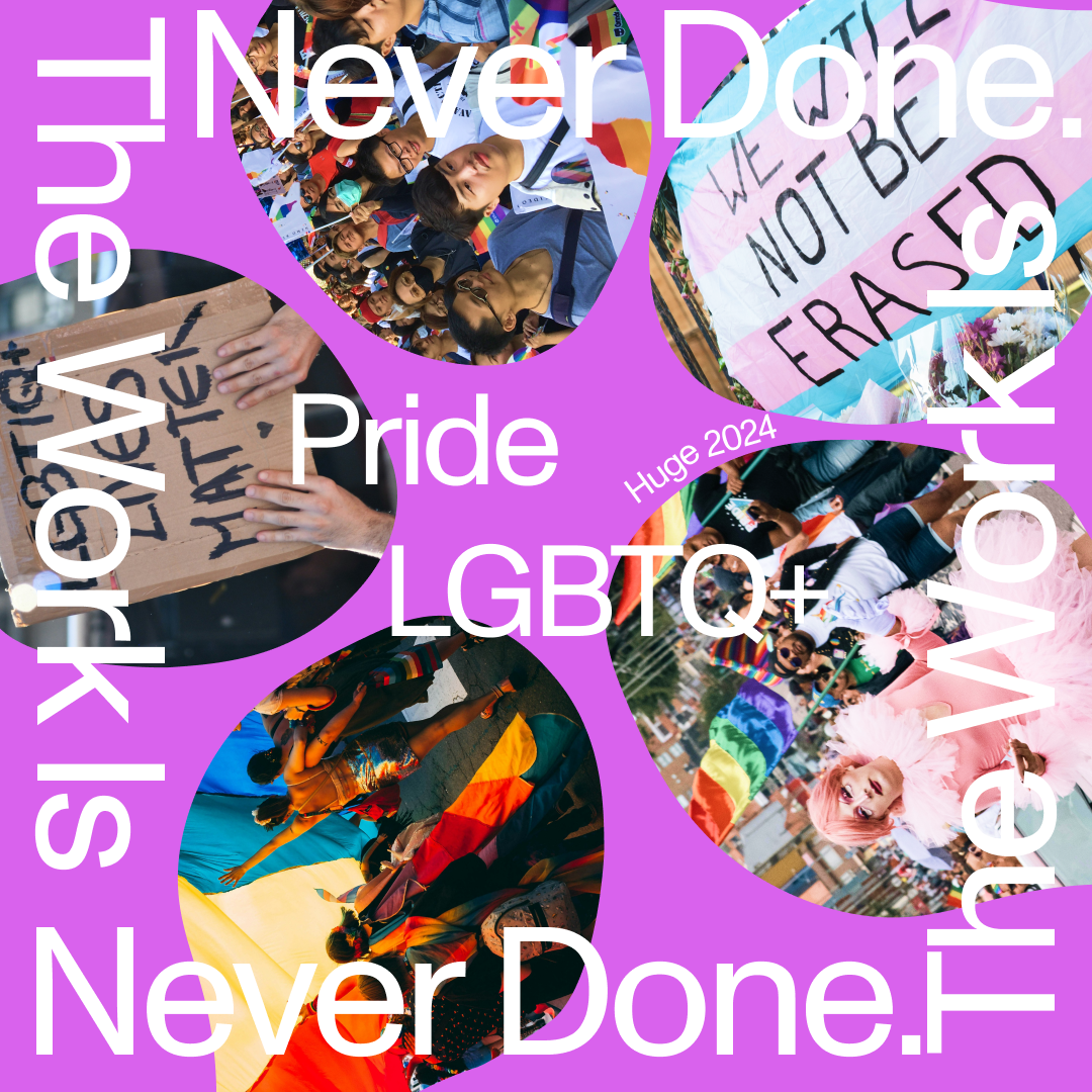
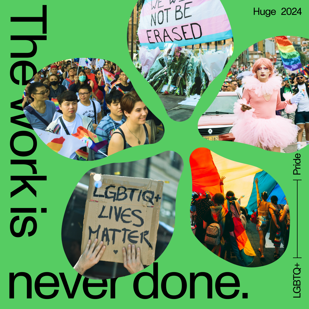
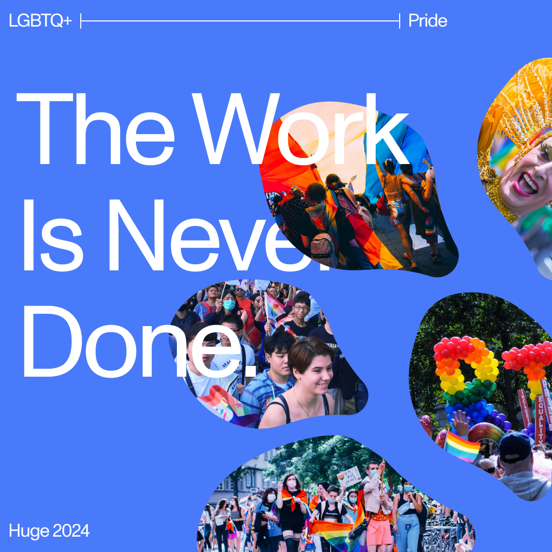
The team selected the flower concept for further development. I explored various layouts, colors, and imagery to optimize the design for both the concept itself and Huge's social media grid and style guide.
While some explorations were successful, the team felt the message got overwhelmed by the visual elements. We ultimately returned to a simpler iteration, which became the final social media post.