Google Data Viz Library
Pioneering Data Visualization Library for Figma

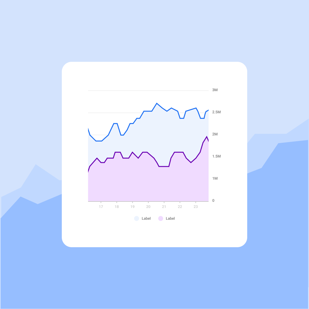
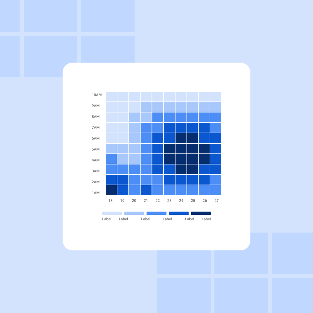
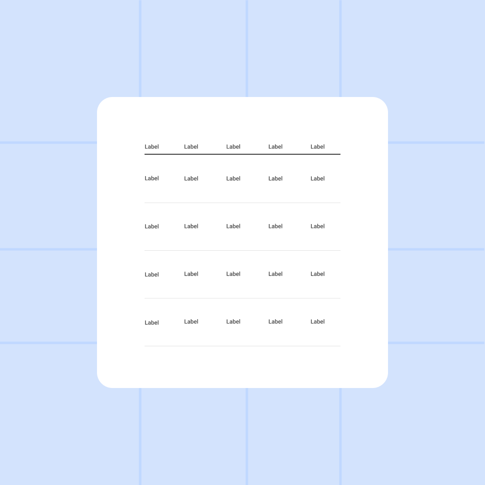
Data visualization is useful to understand abstract and complex concepts. Especially when it comes to search results. As such, this project aimed to create Google Search's first data visualization library. With 9 different graph types, 36 different subtypes of data visualization, and many customizable properties, this library provides the building blocks for an incredible +20,000 possible graphs. We focused on empowering Googlers so they can create incredible ideas and products, all designed for seamless plug-and-play use.
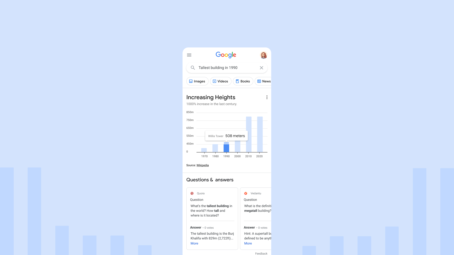
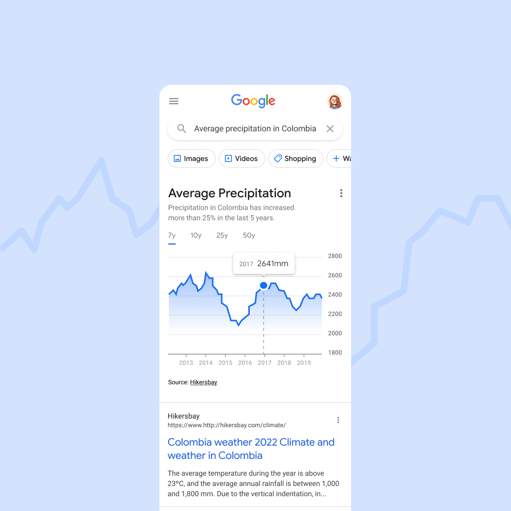
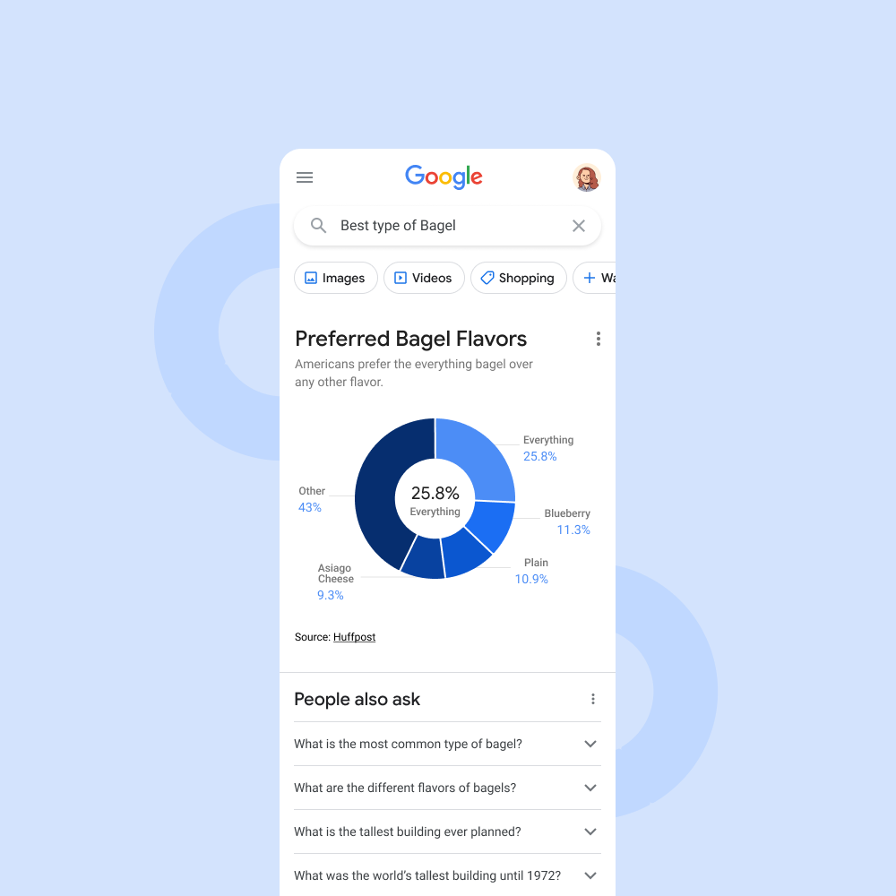
To achieve our ambitious goal of a truly versatile data visualization library, we embarked on a meticulous planning stage. This involved defining the project's scope and meticulously calculating the number of variants required for each graph type.
For maximum user flexibility, we designed each data visualization with three complexity levels, allowing users to choose the level that best suits their data and design needs. Additionally, each visualization came in light and dark themes, optimized for both desktop and mobile use. Through this comprehensive approach, we ensured each component offered a total of 12 variants, exceeding the initial project requirements.
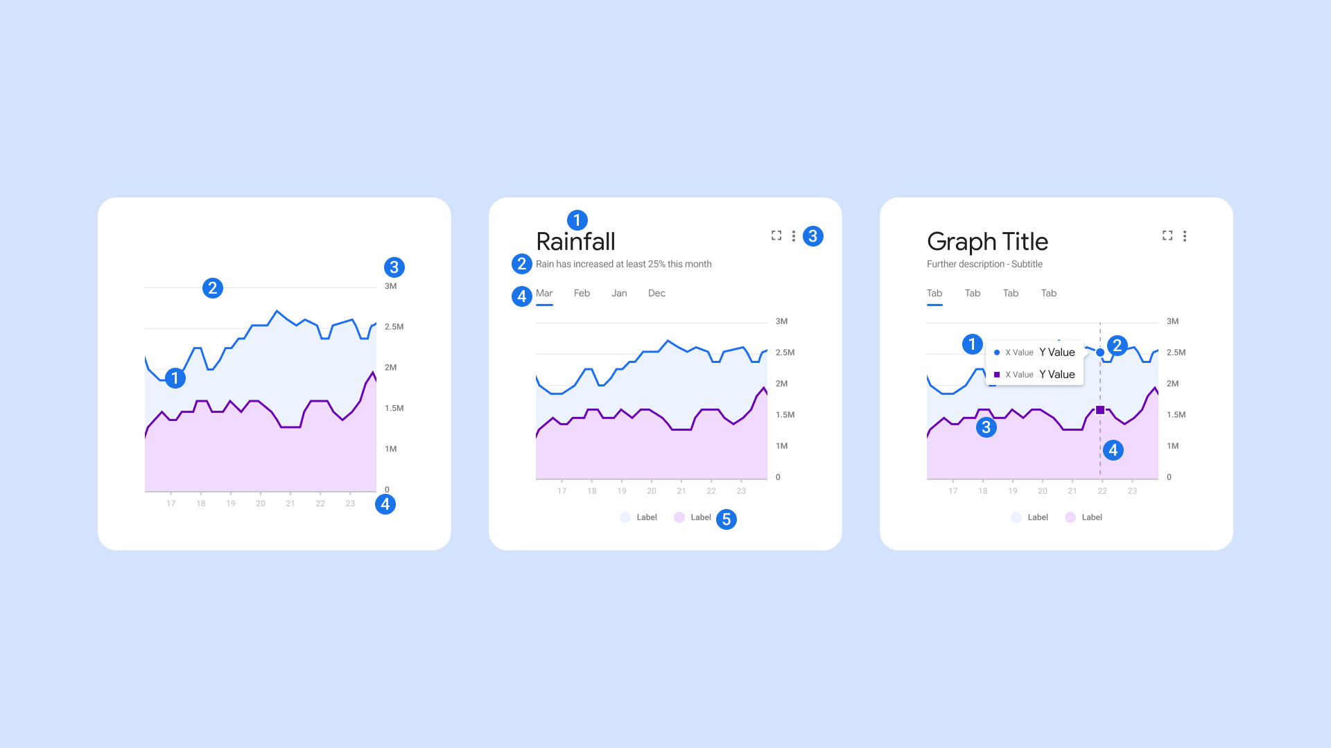
The sheer variety of graphs we envisioned presented a unique development challenge. Recognizing Figma's limitations with resizing complex shapes, we adopted a strategic, staged approach:
Mastering Complexity: We prioritized the most challenging aspects – the graphs themselves. Many graph shapes inherently clash with Figma's resizing functionalities. Through innovative techniques (explained further in a separate section), we tackled the construction of core components like axes, labels, grids, and the main graph shapes, ensuring responsiveness across various screen sizes.
Building the Foundation: Next, we focused on elements common across all graphs, such as titles, subtitles, tabs, and legends. These elements, being easier to develop, formed the core of a Minimal Viable Product (MVP), allowing for early usability testing and feedback.
Refining Interactivity: Finally, we tackled the interactive elements – callouts, guidelines, icons, and animations. While many elements were reusable across graphs, interaction guidelines demanded special attention. We meticulously considered accessibility standards and the specific shapes of each graph type to ensure intuitive user interactions.
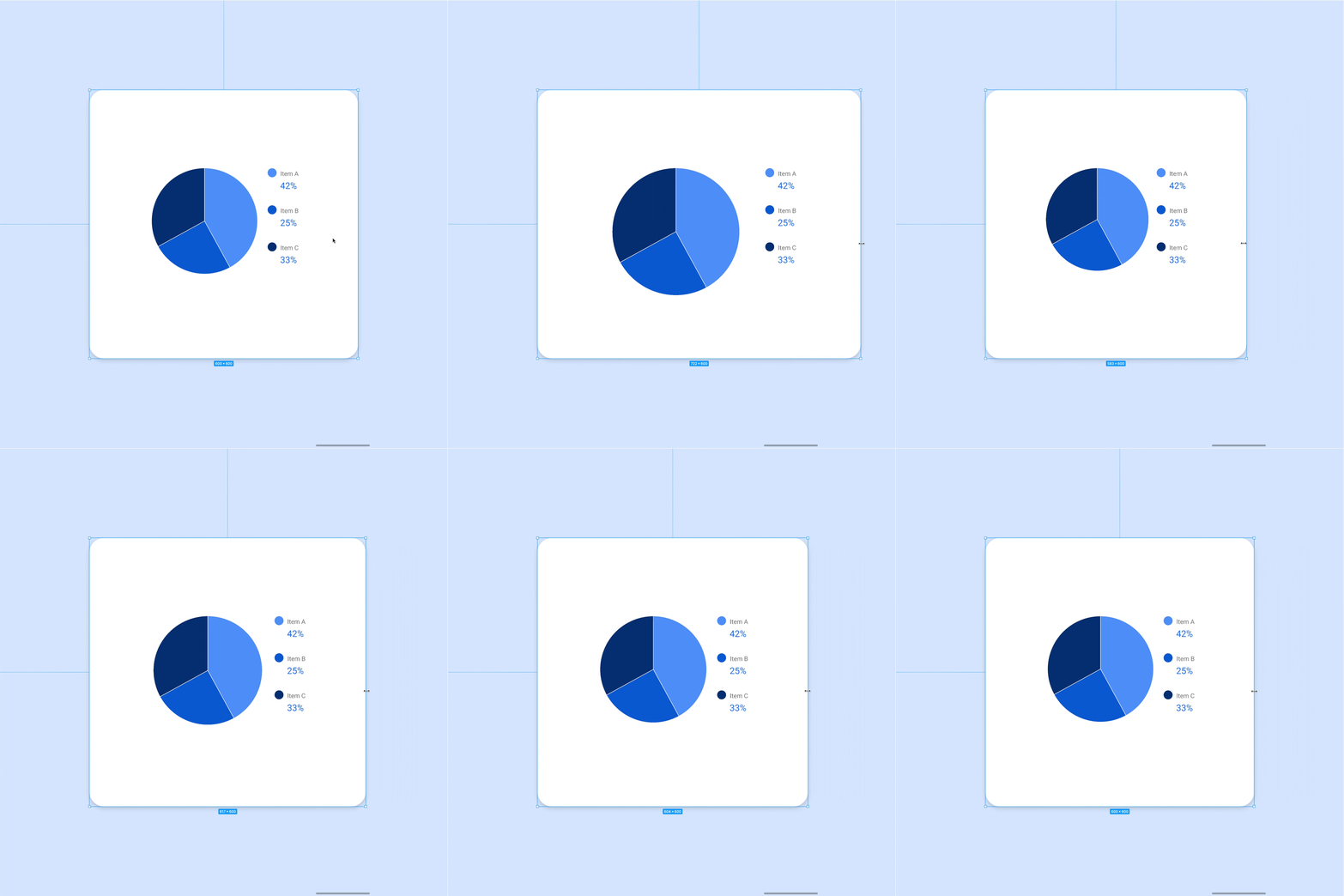
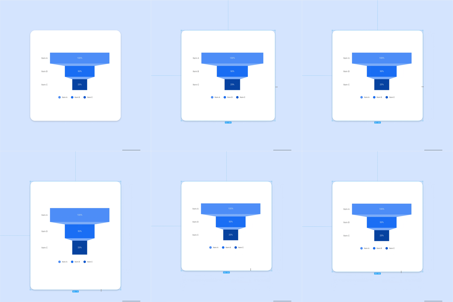
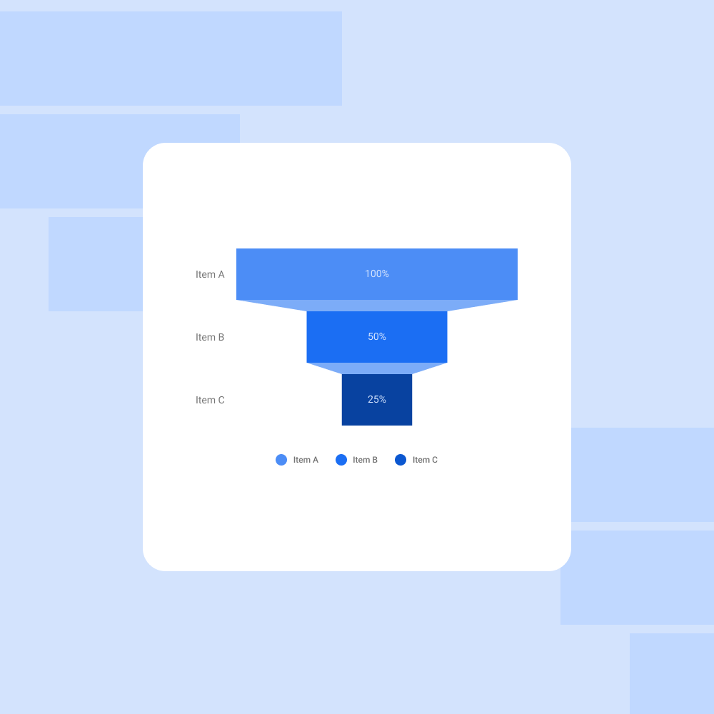
Figma excels at manipulating rectangles and squares, but our vision demanded more. Circular elements in pie charts and the angled forms in funnel graphs presented a significant challenge when it came to responsive design.
For pie charts, we pioneered a technique utilizing aspect ratio constraints within auto layouts. By meticulously defining angles at a granular level, we tricked Figma into maintaining perfect circular shapes regardless of screen size. This approach redefined what was possible for responsive circular elements within Figma.
Funnel graphs posed a different obstacle: maintaining the seamless connection between the bars, particularly in the middle segment. Here, we embraced Figma's strengths. By cleverly segmenting the connection area into smaller squares, we essentially created a shape Figma natively understood – a series of squares. This innovative approach ensured the bars remained perfectly connected throughout all responsive layouts.
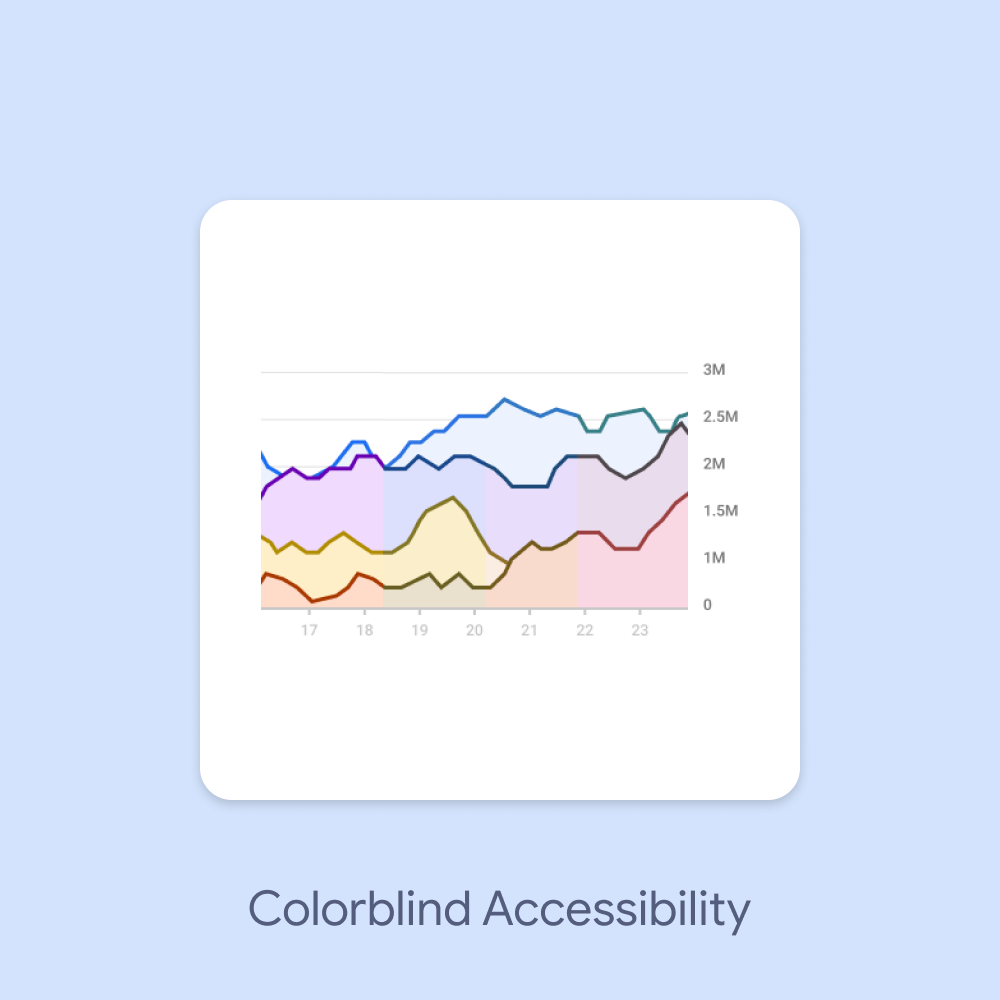
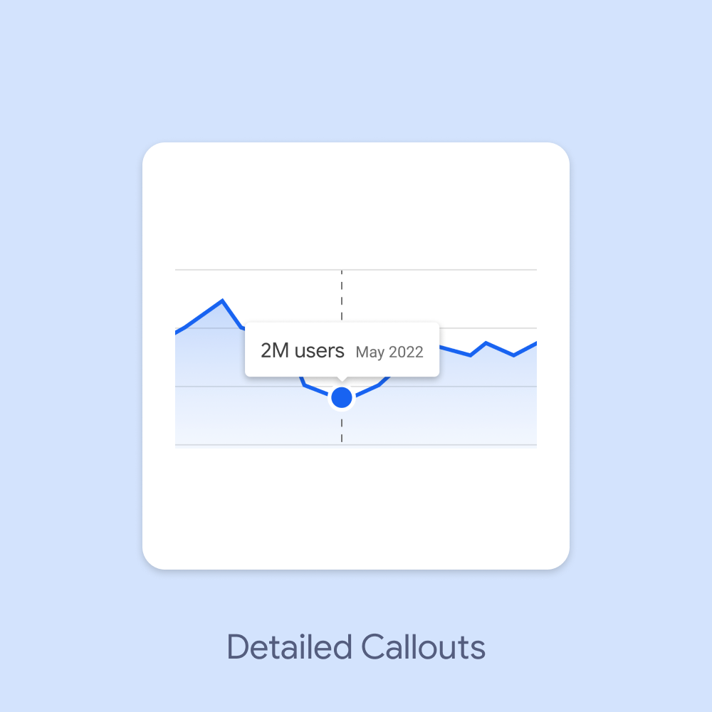
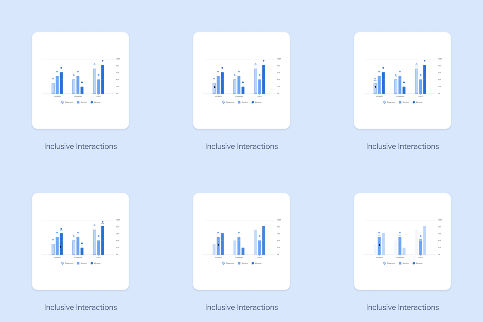
Accessibility was a core principle from the outset, ensuring our data visualizations could be understood by everyone, regardless of ability. We meticulously considered color choices, employing a fully accessible color palette with tokens for easy implementation. This ensured clear information for users with and without color blindness. Furthermore, we incorporated non-color-dependent elements like icons for data categories and clear visual representations of interactions. Transparency was paramount, so we included callouts that reveal detailed information on hover or click, eliminating reliance solely on color for comprehension.
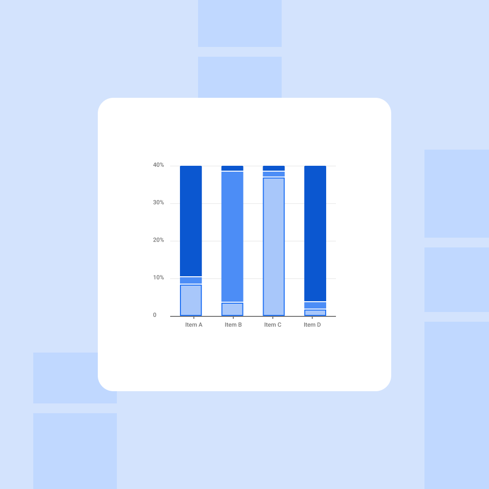
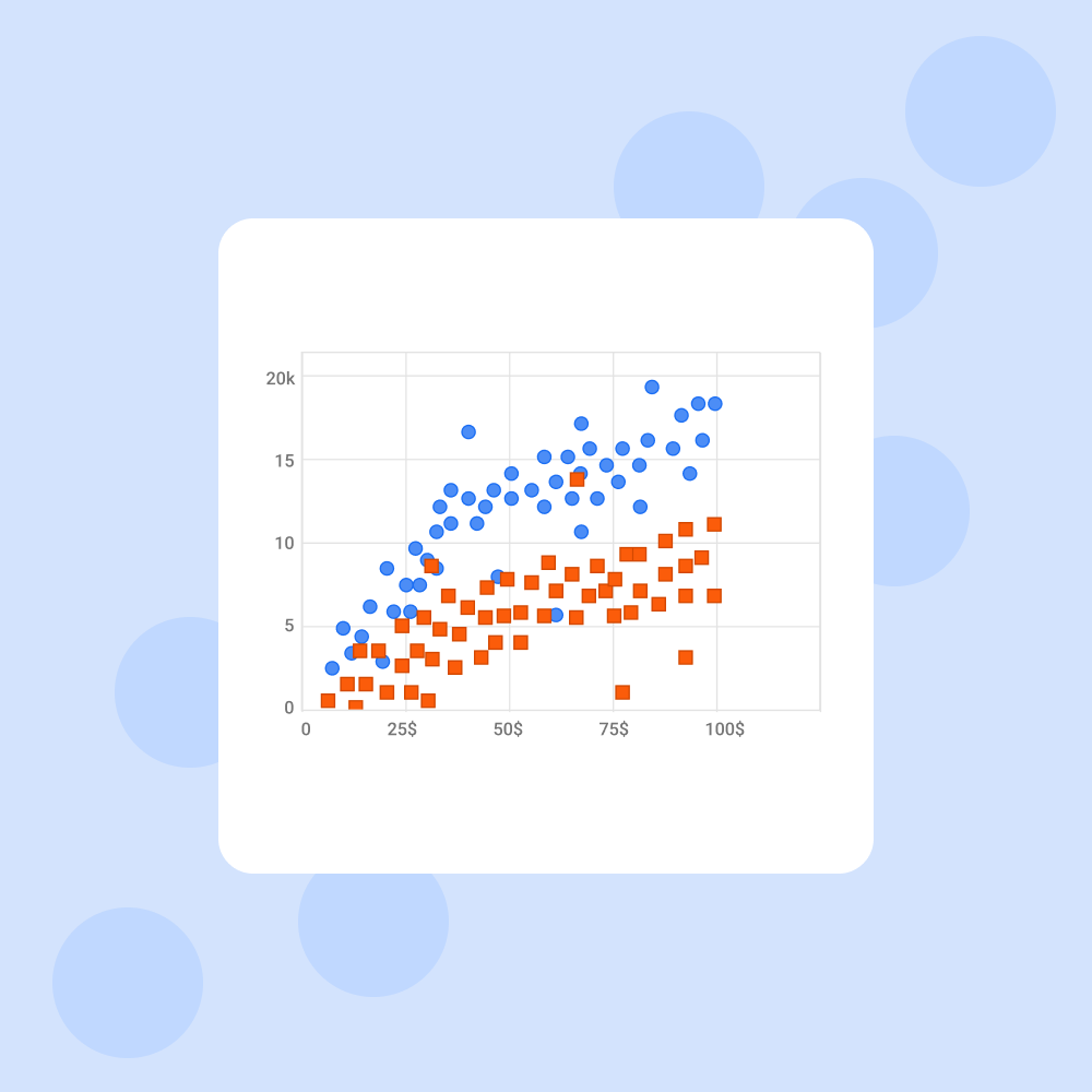
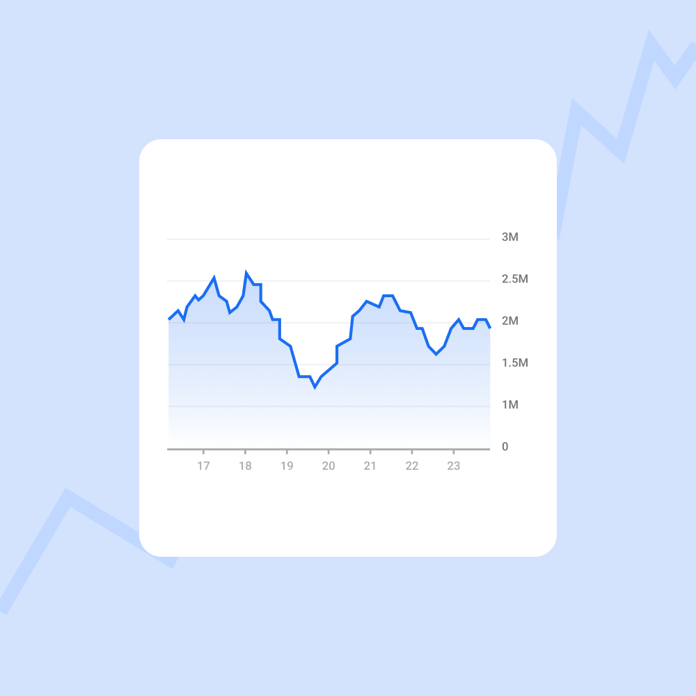
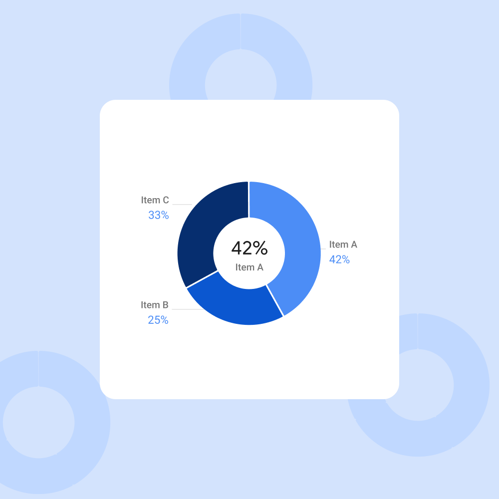
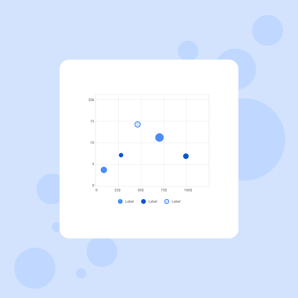
In the end, the ingenuity of our approach garnered significant interest within Google. In recognition of our work, we were invited to deliver a workshop specifically tailored for Googlers, where we shared our newly developed techniques for achieving responsive complex shapes in Figma. This knowledge exchange empowered other designers to unlock the full potential of Figma for their own projects.
Furthermore, the limitations we encountered with nested auto layouts, missing size constraints, and restricted relative positioning informed valuable insights that were later addressed by the Figma team when reported by Google. The inclusion of size constraints in subsequent Figma updates serves as a testament to the lasting impact of this project.
"The work looks fantastic. I really admire your attention to detail and designer's needs. Great work all around, cant wait to use this in my designs."— Adin Kann, Visual Designer at Google