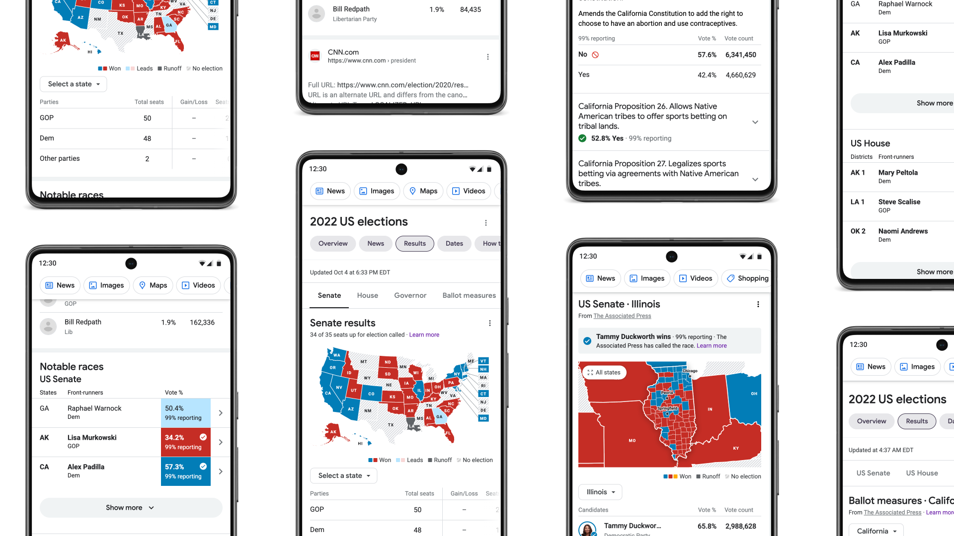
2022 Midterms
Visualizing Democracy: A Clear Look at US Elections
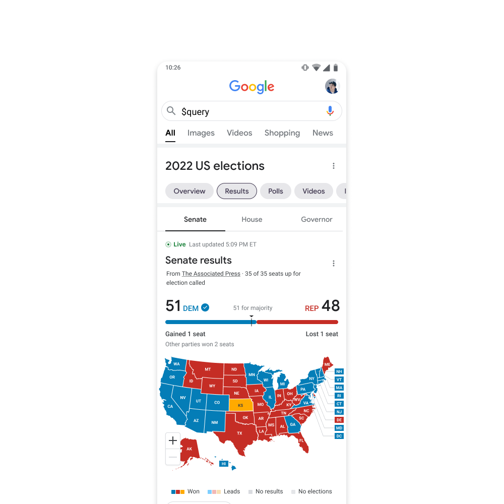
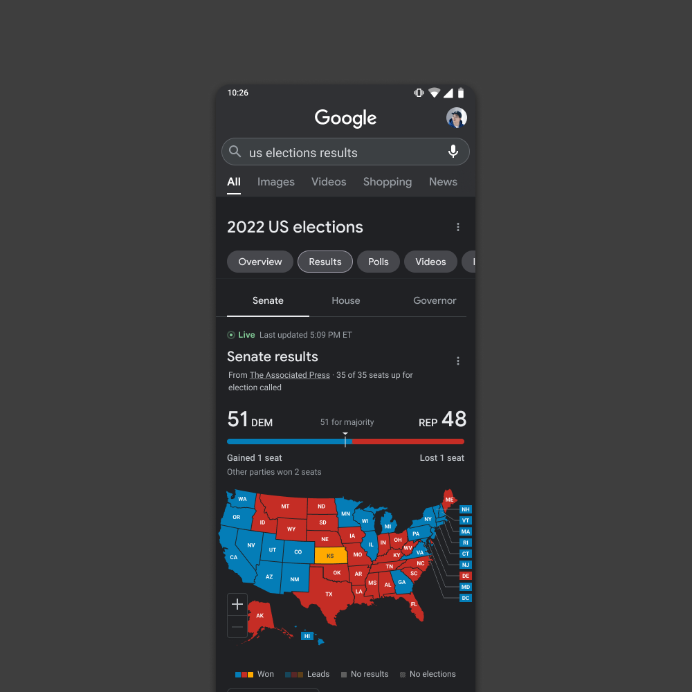
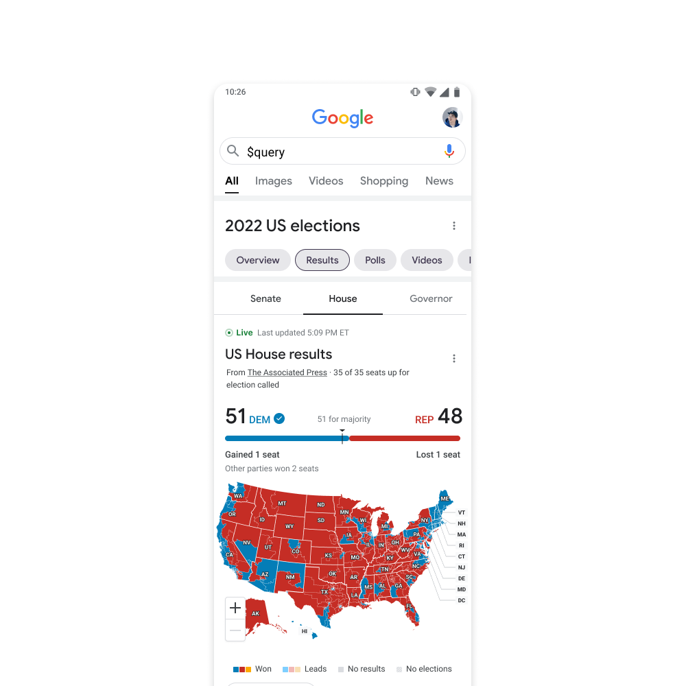
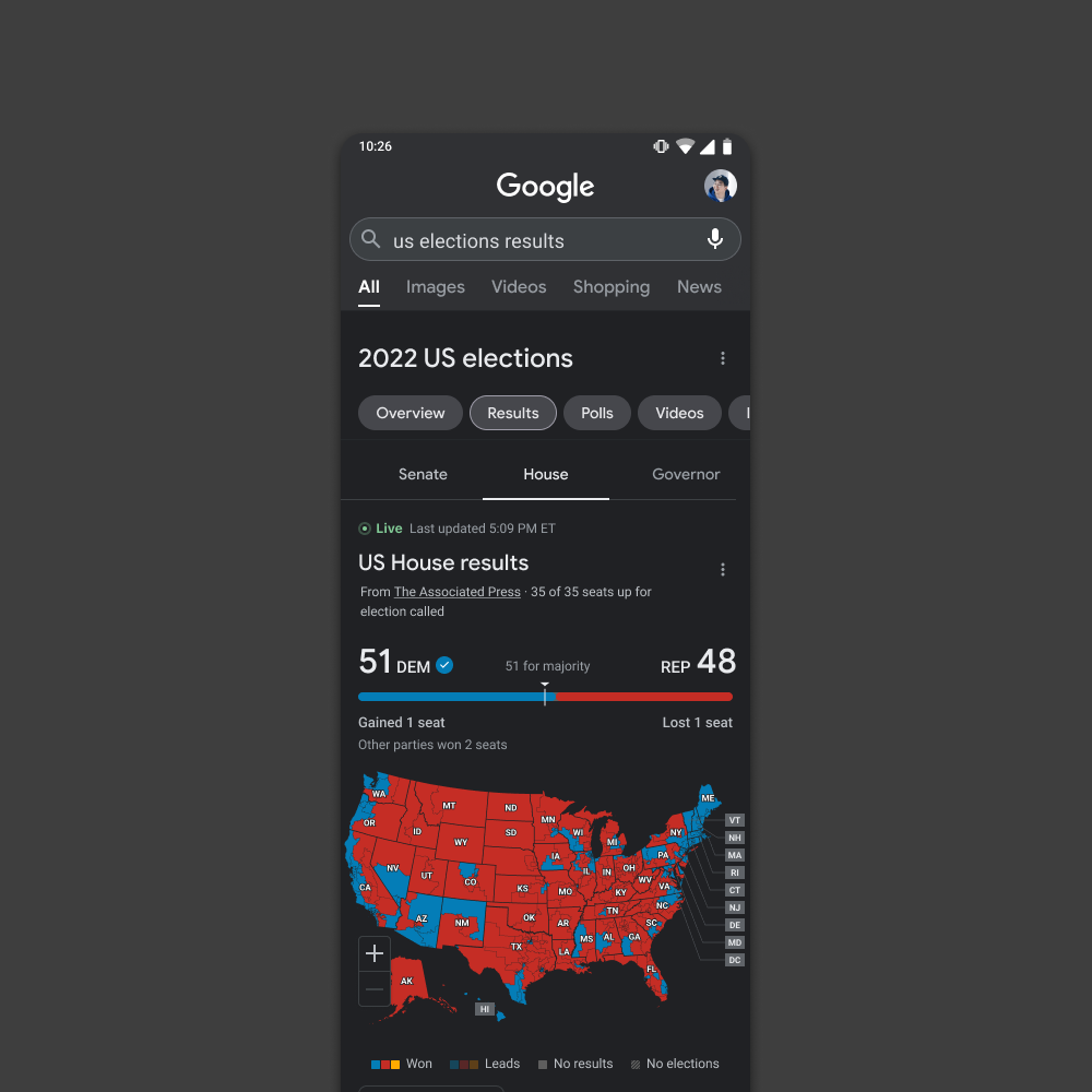
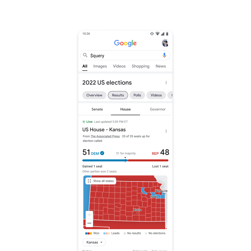
We developed a completely new color palette that achieved at least AA accessibility standards while maintaining a recognizable visual representation for the two major political parties. This involved striking a balance between adhering to established party brand colors (within limitations) and ensuring clear differentiation in both win and leading states. We meticulously considered the impact of color across all interface components to guarantee an accessible and informative experience for all users.
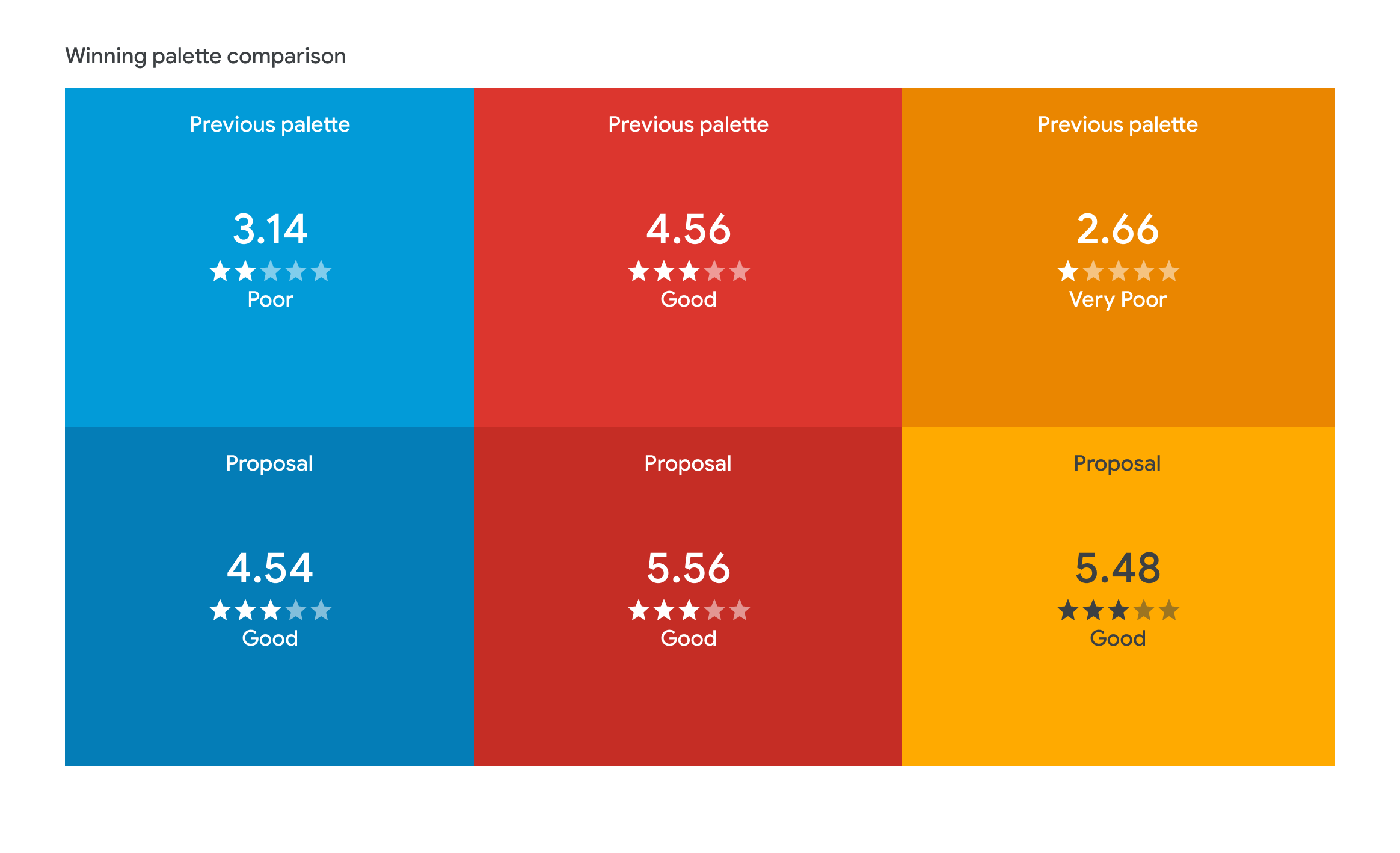
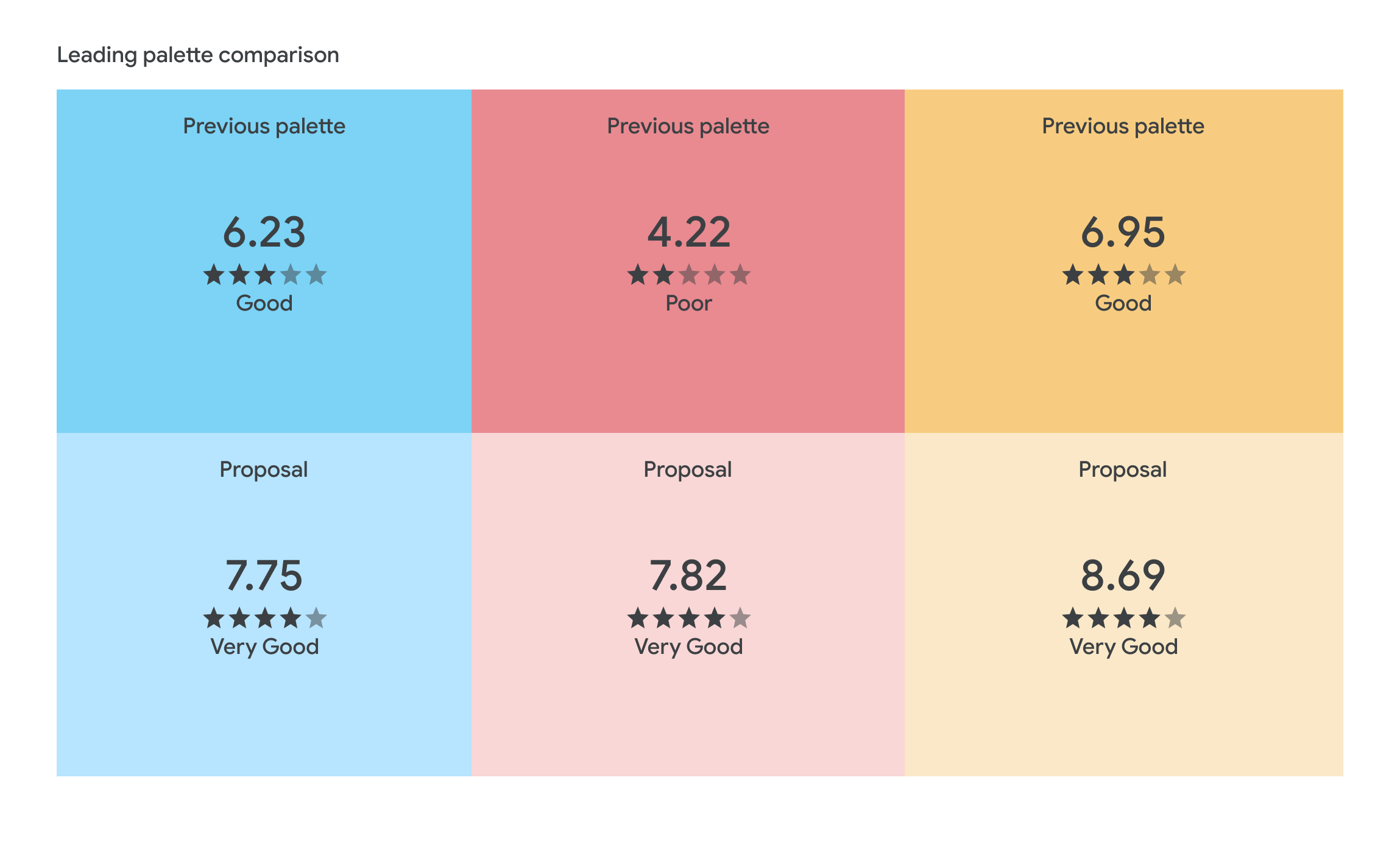
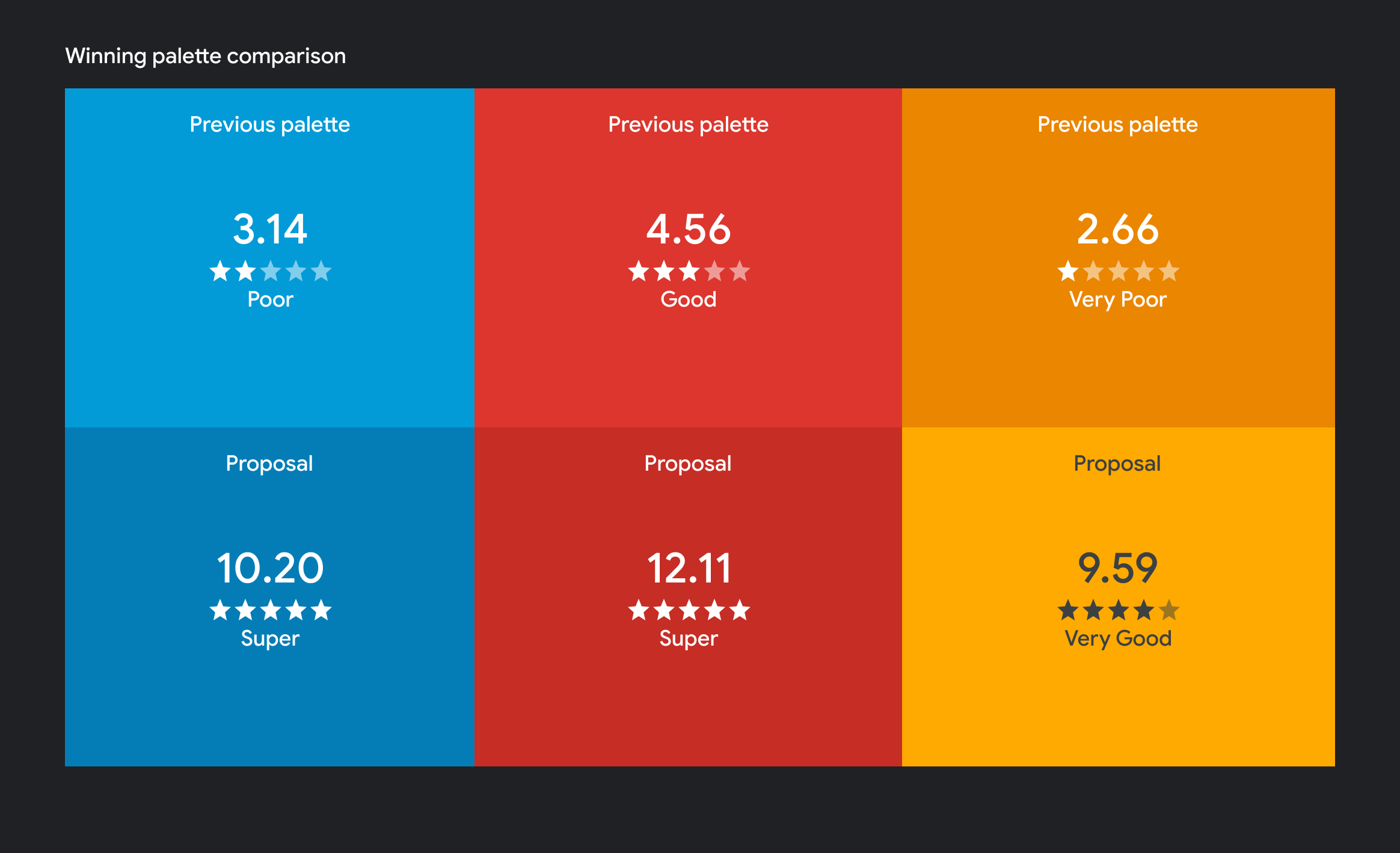
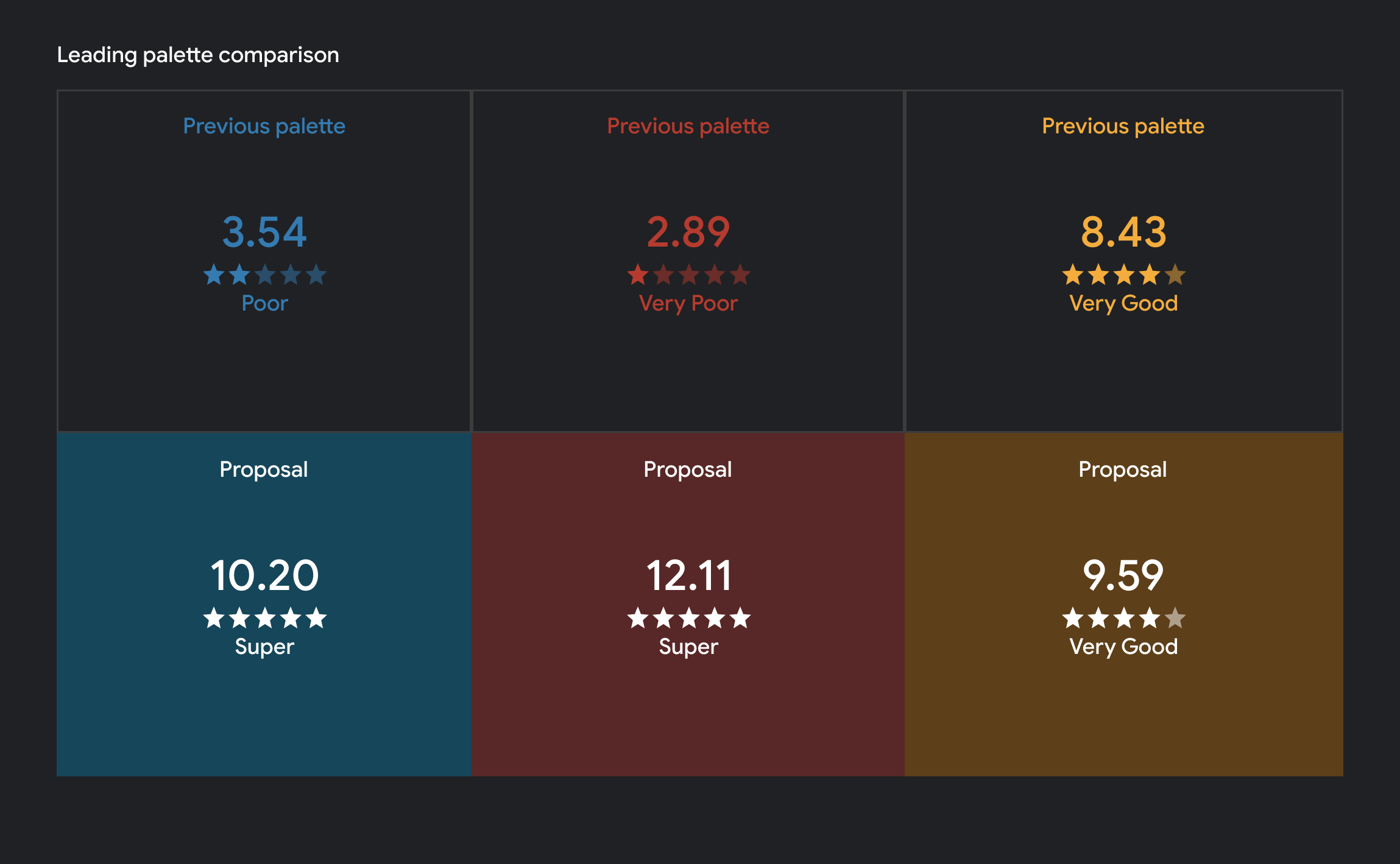
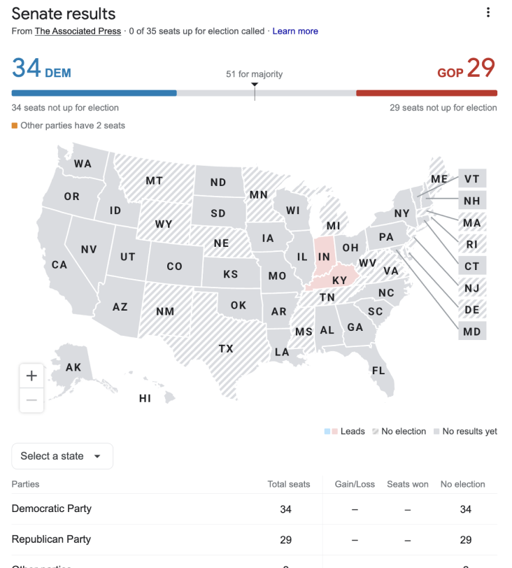
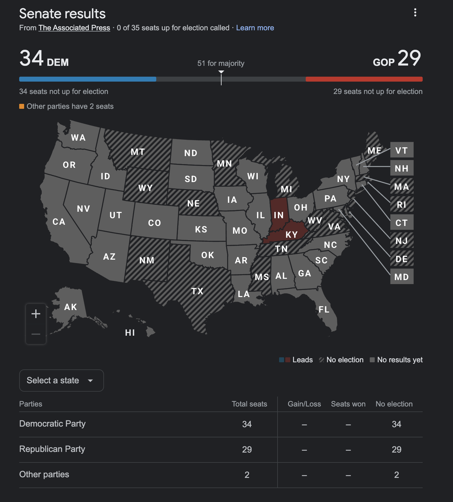
The initial color scheme presented a challenge for accessibility. White text on various UI components, particularly state abbreviations displayed on the map during election results, lacked sufficient contrast. To ensure optimal accessibility for all users while maintaining a clear visual association with each political party, we implemented several adjustments. The Democratic and Republican hues were darkened to improve readability, adhering to their established color palettes. The third-party color, on the other hand, was lightened to provide better contrast with white text. Additionally, the text color for the third party was changed to dark gray. Finally, we lightened the "leading" color palette to further enhance text contrast. These changes resulted in a visually appealing interface that adheres to accessibility best practices while still reflecting the traditional colors associated with each political party.
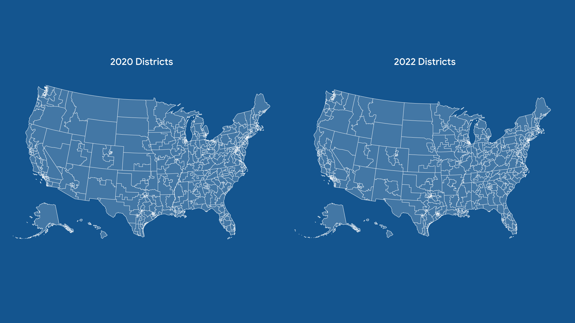
Following the 2021 redistricting process, we were tasked with updating the U.S. map for the upcoming midterm elections. Google required us to increase the map's detail while maintaining a file size under 200kb for optimal performance. Leveraging an internal resource tracking the latest redistricting developments, we strategically prioritized highlighting states with finalized district borders. This approach allowed us to showcase the progress while acknowledging the ongoing process in more contentious states.
For interactivity purposes, every district had to be completely outlines on top of the state borders. Coupled with the need for more detail for the overall map, this meant, the file's size more than doubled our limit of 200kb. With this in mind, we resorted had to optimize the file as much as possible using Adobe Illustrator's conversion setting, and the webapp SVGOMG. Nevertheless, this proved to not be enough and we had to understand the structure of an SVG file to modify it in a way that we could make sure the file could be as small as possible.
Learnings
When there is a limit to the file size, check the size as you go to make any updates in a timely manner.
It is important to check contrast of all interacting colors, not only with the background, but with each other.
Illustrator has many diffeerent ways of producing SVGs and all give out different results with SVG files of varying sizes and precision of the vertices.