Chrome UX Design System
One Chrome, by design.
Understanding
Drawing from an introductory session on the Chrome team's design philosophy and its design system, we developed a three-part framework to analyze the existing system, evaluate the team's interaction with it, and measure the resulting outcomes in the product:
- [person] User Research: stakeholder interviews across various teams and seniority levels to identify pain points within the existing design system and its governance model.
- [manage_search] System Audit: audited each Figma file in the system, analyzing their adherence to best practices for design systems and their coherence with the final production.
- [groups] Co-creation: collaborative sessions and activities to gain a deeper understanding of each team's creative process and their priorities for their respective platforms.
Research
A complex problem with multiple viewpoints
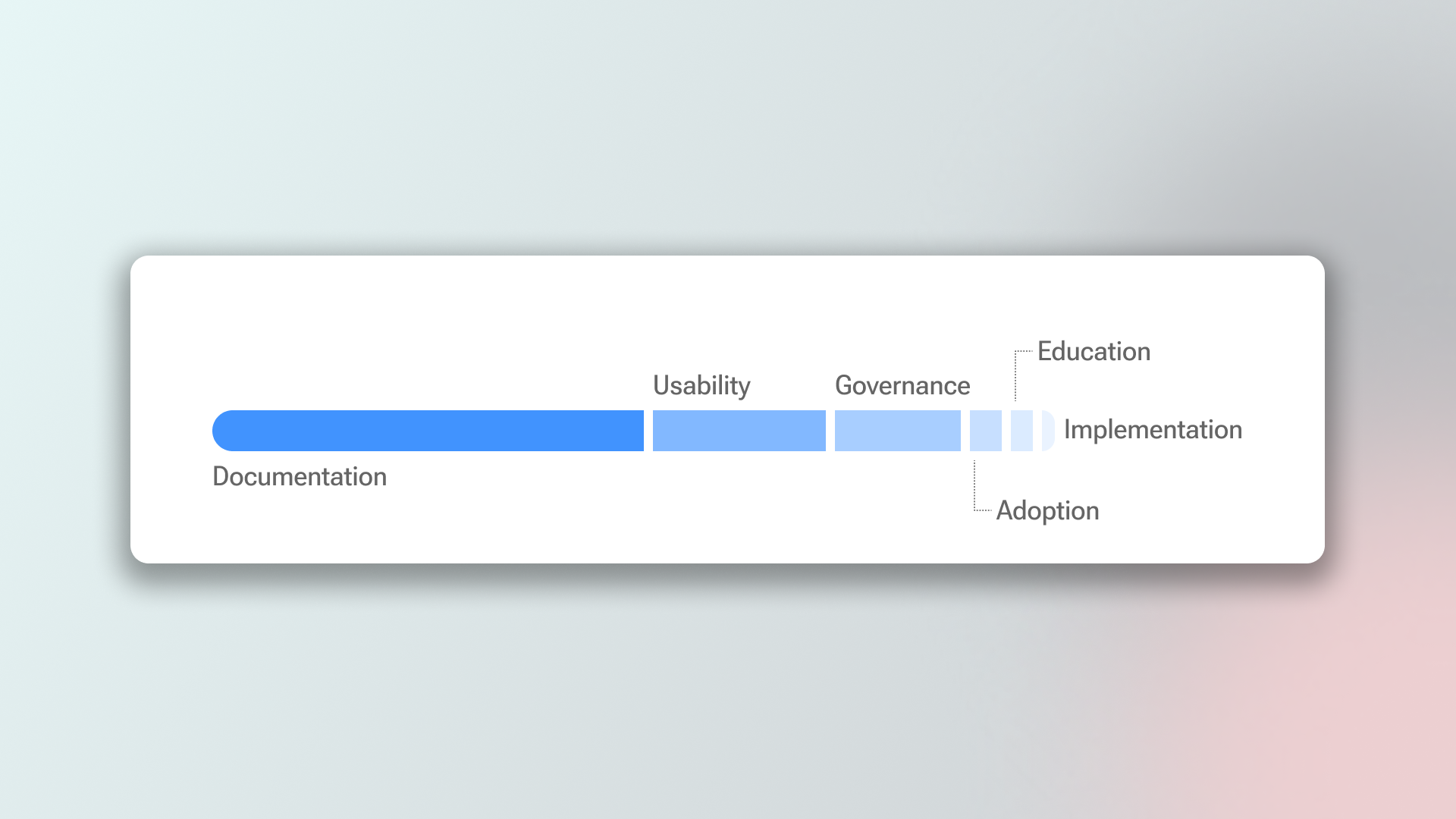
Our interviews uncovered key insights across six critical areas: Governance, Education, Usability, Adoption, Implementation, and Documentation. To prioritize these many opportunities for improvement, we cross-referenced the frequency of reported pain points with the seniority of the stakeholders who raised them. This approach allowed us to identify the most impactful and widely-felt issues to address. Some examples are:
- 63% expressed frustration with the lack of documentation for files and components.
- 57% found the processes around the system confusing and hard to maintain.
- 44% felt that other team members were not educated enough on Figma's latest features.
Audit
Identifying needs and improvement opportunities
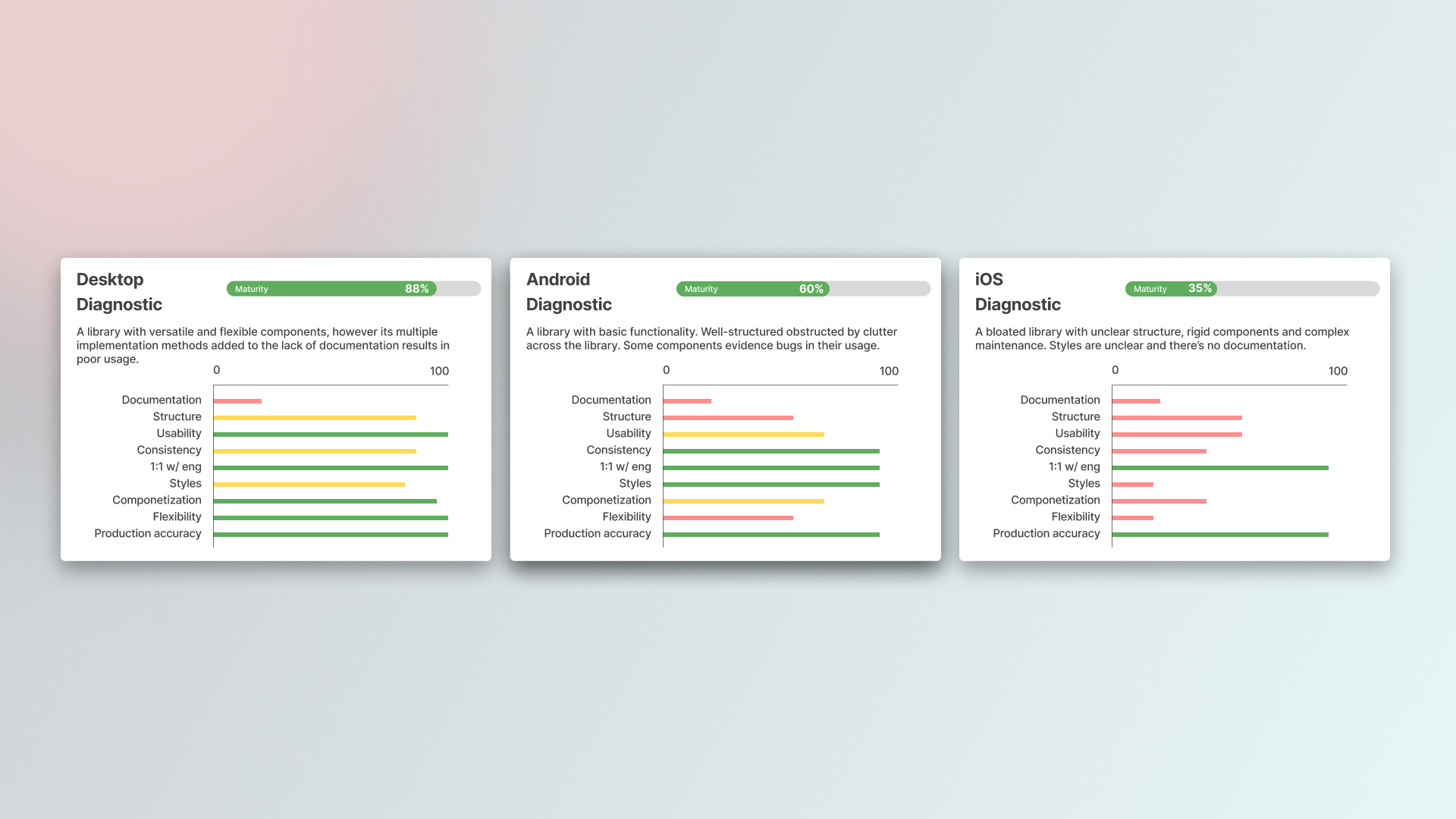
To create a consistent experience across all platforms and teams, I designed an audit process based on Atomic Design principles and standard UX best practices. This process allowed us to measure the maturity level of each platform objectively.
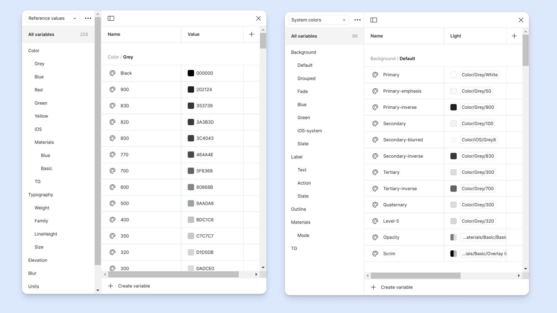
Based on our user research and the insights gathered from interviews, we measured the main system files for each platform against nine key criteria: Documentation, Structure, Usability, Consistency, Engineering Alignment, Styles, Componentization, Flexibility, and Production Accuracy. This systematic approach allowed us to cross-reference our qualitative findings with objective data from both the live product and the design files, ensuring our audit was both comprehensive and grounded in real-world observations. In the end, we came out with three main conclusions:
- [article] The lack of comprehensive documentation for components and their usage across the product. This gap led to inconsistent implementation and inefficient workflows
- [brick] The system files existed at vastly different maturity levels, which created significant friction and hindered collaboration
- [account_tree] The inconsistent structure and disparate governance models of each file made maintaining the system difficult and introduced significant operational overhead.
Action Plan
A multi-faceted strategy
Leveraging our insights into the platform, the team, and their design philosophy, we developed a multi-faceted action plan to elevate the Chrome UX team's design system. Given the scope and timeline, we created a strategy with three parallel tracks to efficiently achieve our shared North Star:
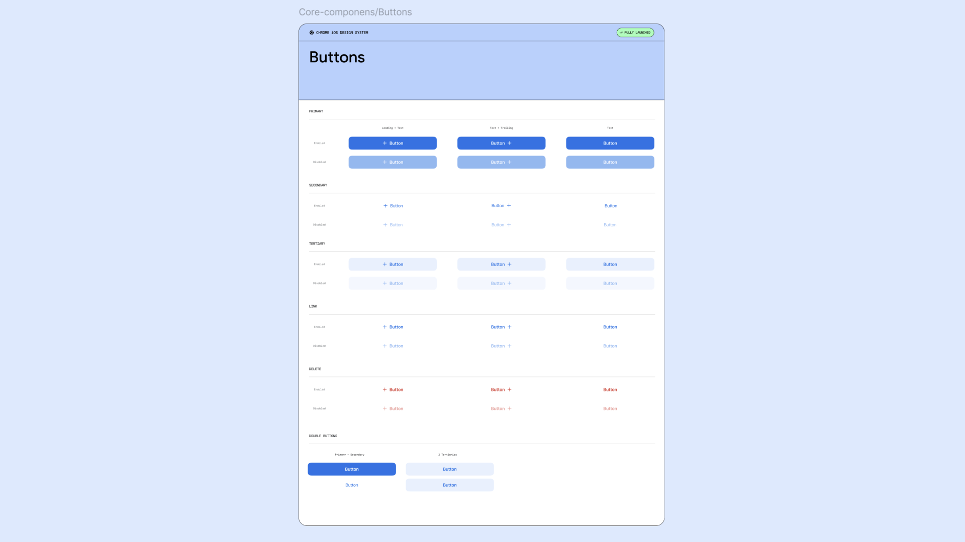
- [article] Create a unified, easy-to-maintain documentation structure for all components across every platform, centralizing it in a single location that designers can access at any time.
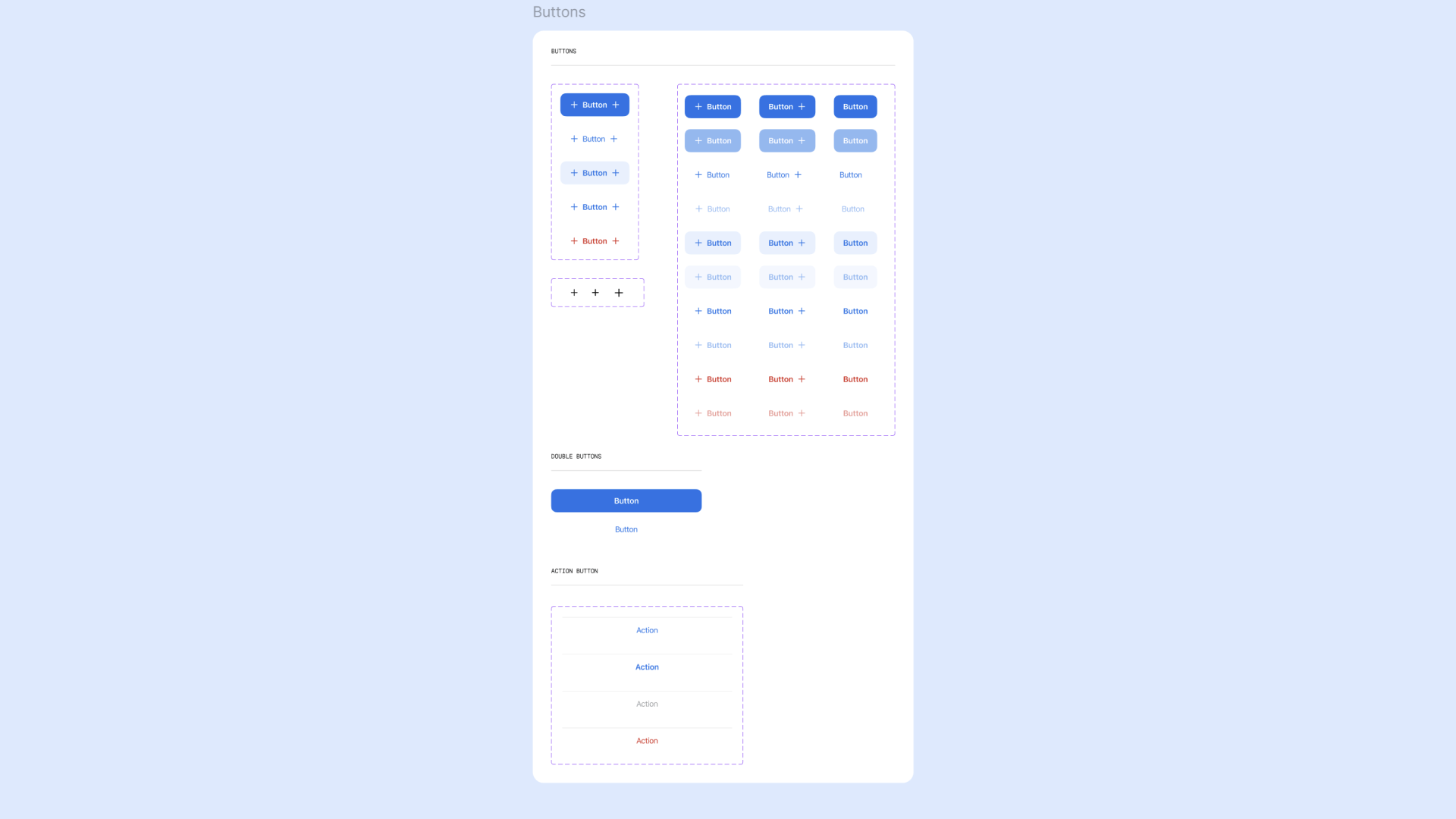
- [automation] Revamp and standardize each platform's components to be scalable, flexible, and future-ready.
- [groups] Establish a definitive process for component approval and integration into the design system to ensure long-term health and consistency.
Results
New beginnings, new Chrome.
Upon the conclusion of this initial timeline, we successfully established a strong foundation for the new Chrome UX Design System. Our work resulted in all files being leveled, the creation of a comprehensive source of truth, and the implementation of a clear governance model.
- [desktop_windows] Desktop: We introduced new documentation and added over 20 new components, expanding the library's utility.
- [android] Android: We overhauled the file structure, implemented variables, and integrated robust documentation.
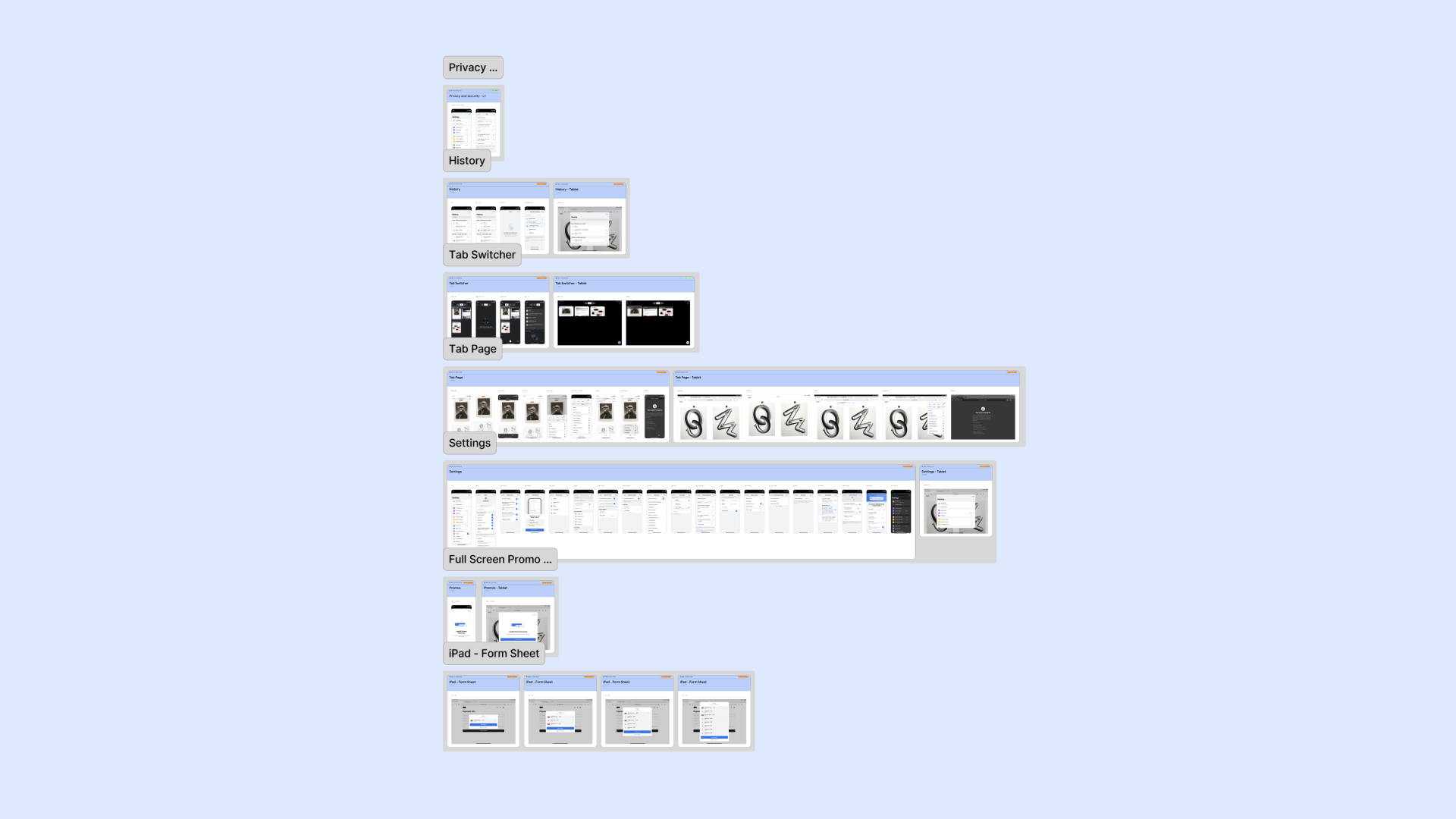
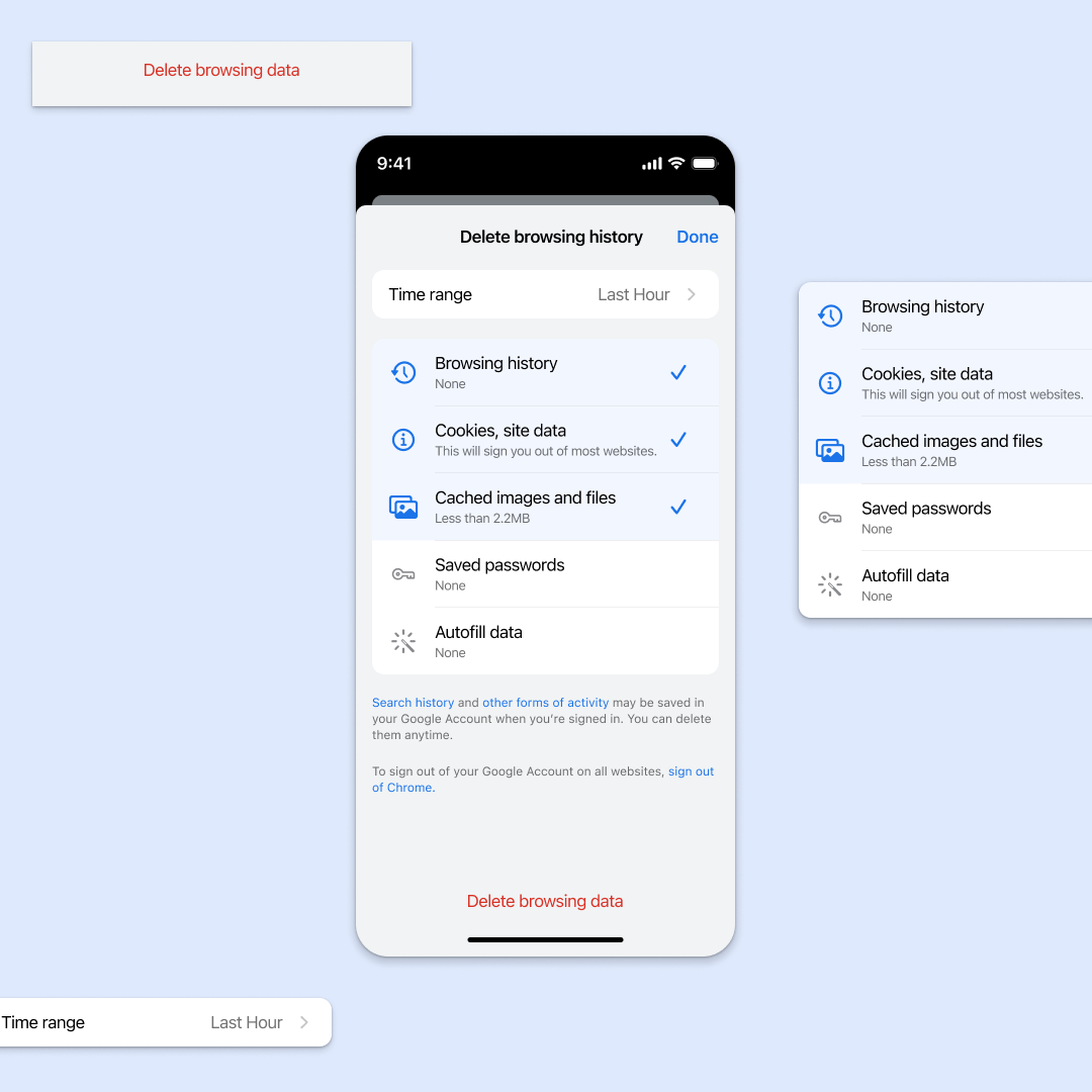
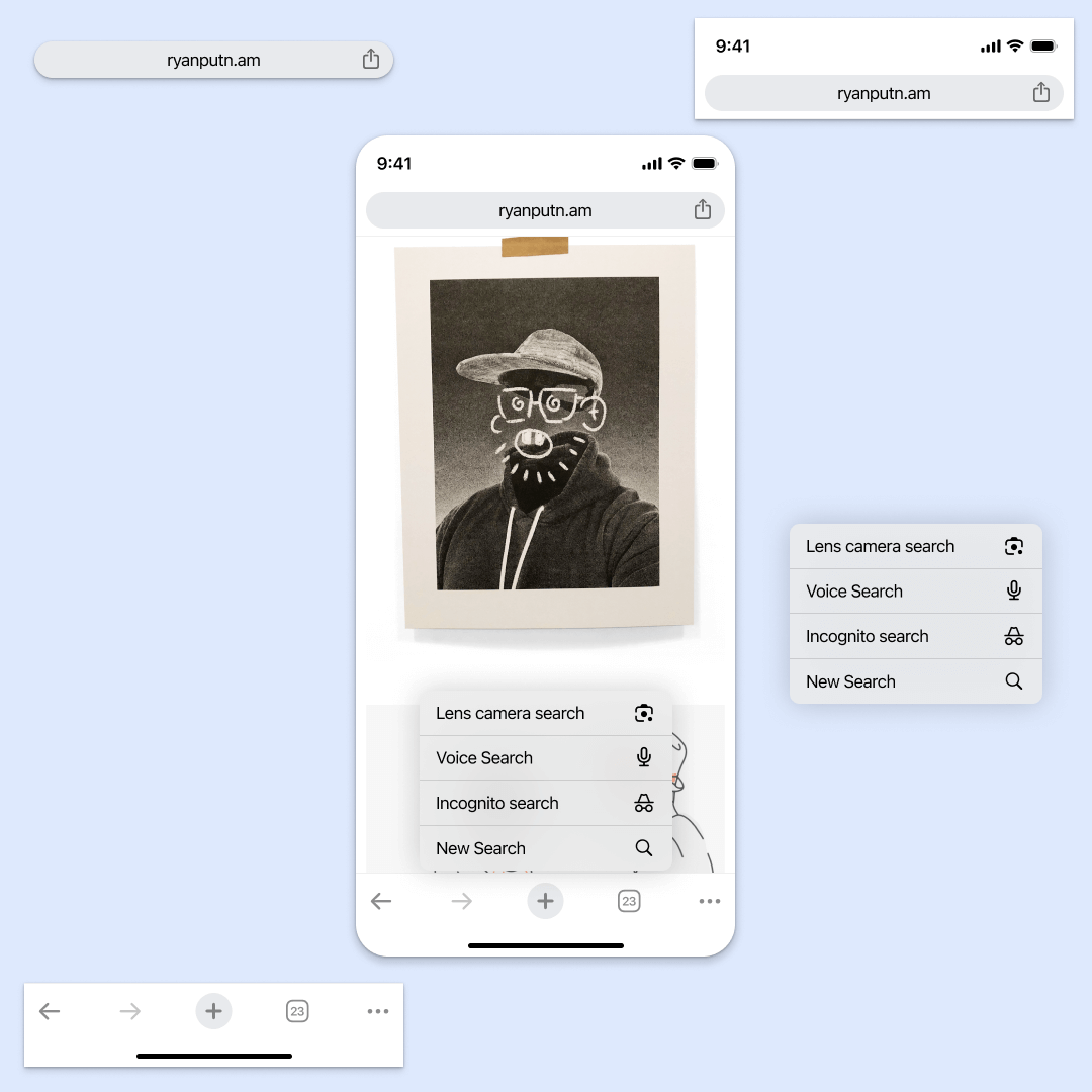
- [ios] iOS: We completely rebuilt the file from the ground up, effectively reducing the component library from over 1,700 to just 120, significantly improving efficiency and maintainability.
- [radar] Satellite Teams: We created cross-platform sticker sheets derived from the main libraries, providing satellite teams with the custom components they needed while maintaining system coherence.